

Last Updated on July 31, 2026
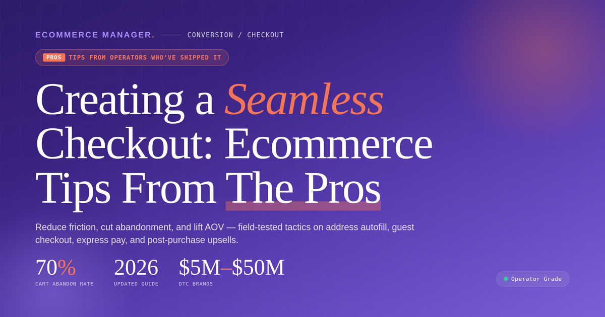
Creating a Seamless Checkout: Ecommerce Tips From The Pros
Abandoned carts cost online retailers billions every year, yet most checkout friction stems from a handful of preventable mistakes. Industry experts have identified sixteen specific strategies that measurably reduce cart abandonment and boost conversion rates. This guide breaks down each recommendation with practical implementation steps that work across platforms and business models.
- Confirm Deliverability Before Cart Entry
- Describe Items In Plain Language
- Make Accounts Optional Not Required
- Decide Subscriptions On The Product Page
- Remove Every Nonessential Step
- Display Exact Arrival Dates Per Tier
- Design Purchase Flow Mobile First
- Place Trust Signals At Decision Points
- Sync Transactions With Back-End Systems
- Present Total Cost Upfront
- Add Express Wallets And Fewer Fields
- Use Single-Focus Pages With Direct CTAs
- Reveal Pricing Rules Only When Needed
- Enable Local Payment And Pickup Choices
- Auto-Recall Customer Details Mid Purchase
- Provide Contextual Help At Hesitation
Confirm Deliverability Before Cart Entry
Our highest-impact checkout fix was actually upstream of checkout: guaranteeing accurate stock and shipping-country availability before the customer ever reaches the cart. We were losing orders at the final step because a product couldn’t actually ship to the buyer’s country — and they only found out at checkout. We now verify deliverability to our top markets (US, France, Germany and five others) at the product level, so nothing enters the cart that can’t be fulfilled to that shopper. A checkout feels ‘seamless’ when there are no surprises in it — most friction is inherited from decisions made three pages earlier.

Describe Items In Plain Language
My best tip is to make your checkout tell the customer in plain words what they are about to buy, rather than showing them a product code. On a technical store the last doubt before payment is not price or delivery, it is did I pick the right one, and a checkout that answers that with a SKU sends people back to the product page to double check.
Ours used to do exactly that. The order summary showed a thumbnail, a title and a variant string along the lines of EVC-T2-32-7. To me that read as precise. To a driver who had just spent twenty minutes working out what fits their car, it meant nothing, so a fair few clicked back to the product page for reassurance. Once you are back on the product page you are back in comparison mode, and plenty of them never returned to the basket.
The fix was small. We rewrote that summary line the way a person would say it out loud, Type 2 to Type 2, 7m, 32A, single phase, with a short line underneath naming the cars it suits. Nothing else on the page changed. Checkout completions rose by about 11%, and the clicks back out of the summary dried up.
The principle is worth more than the tactic. A checkout is not just a form to be shortened, it is the place where someone’s last doubt either gets answered or gets left hanging. Work out what your buyer is quietly unsure about at the moment they reach for their card, then put the answer right there, in the words they would use themselves.

Make Accounts Optional Not Required
We removed the account creation requirement from checkout entirely, which we’d resisted for about a year because someone had decided early on that building a customer account base was important enough to make it mandatory.
The resistance to changing it came from whoever had made that original decision still being in the room. Once we actually looked at where people were dropping off in the checkout flow, the account creation screen was losing about 38 per cent of the people who reached it.
We turned it into an option using a checkbox and a line that explained they could save their details for next time. Checkout completion rate improved from roughly 54 per cent to about 71 per cent within the first month.
Account creation rate actually stayed similar because people opted in voluntarily when the decision felt like theirs, rather than a gate they had to pass through.
The revenue recovered in that first month was around $12,000, which made the year of resistance to changing it fairly uncomfortable to think about.

Decide Subscriptions On The Product Page
The single biggest lift we’ve seen at Happy V came from moving the subscription-vs-one-time decision out of the cart and onto the product page as the visual centerpiece, with the recurring price, cadence, and cancel-anytime language sitting directly under the buy button. In consumer health, the subscription decision has to happen at the product level — if they reach the cart still unsure, you’ve already lost them. Women buying a probiotic for intimate health aren’t impulse buyers; they’re evaluating whether this becomes part of a routine. One thing we heard repeatedly from support was hesitation around getting locked in, so we made the cancel language plain and put the next ship date in view — anxiety about the second charge is what actually drives churn, not the first. We rolled it out on our highest-traffic SKU first, held it against the old layout for two weeks, then pushed site-wide once the retention curve held past the second refill.

Remove Every Nonessential Step
My best tip for a DTC checkout is to treat every field and every step as a cost you have to justify, because each one is a place a paying customer changes their mind. It’s tempting to collect data at checkout while you have someone’s attention, but every extra question is friction standing between a visitor and a completed order, and friction at the till is the most expensive friction there is.
The specific change that moved the needle for us was stripping the checkout back to only what we needed to fulfil and support the order, and pushing everything else, preferences, profile details, the marketing opt-in nudges, to after the purchase was confirmed. Ask for the nice-to-haves once the money’s in and the customer is in a good mood, not while they’re deciding whether to commit. We also made the guest path the default rather than forcing account creation, because nobody abandons a cart faster than when they’re told to make a password first.
The result was a measurable drop in abandonment at the payment step, in the region of a 15% reduction, from doing less rather than more. A seamless checkout isn’t a design flourish, it’s the removal of everything that gives a committed buyer a reason to pause.

Display Exact Arrival Dates Per Tier
I pulled up my checkout analytics about a year ago and noticed a large share of customers were abandoning right at the shipping step. They had already picked their products and typed in their info, then stopped when shipping options loaded with no clear delivery estimate. So I added plain-language delivery windows next to every shipping tier.
My customers are dealing with chronic pain and skin conditions, and they are ordering because they need relief. A concrete date like “arrives by Thursday” removed the hesitation I was seeing at that step. The abandonment rate at that step dropped within the first few weeks, and average order value rose too, because more people started selecting faster shipping once they could see exactly what they were paying for in real terms.

Design Purchase Flow Mobile First
I’ve built or rebuilt over 500 brand presences, and a big chunk of that work touches eCommerce directly—so checkout friction is something I’ve had to diagnose and fix repeatedly across very different industries.
The single most impactful optimization I’ve made: build mobile-first, not mobile-friendly. There’s a difference. When we built DavidSW’s luxury watch marketplace on WooCommerce, we didn’t adapt a desktop experience for mobile—we designed the entire purchase flow around a thumb-driven experience first, then scaled up to desktop. The result was a fast-loading, intuitive checkout that matched the trust level their high-ticket products demanded.
For DTC specifically, trust collapse usually happens at checkout, not earlier. A customer who browses comfortably on their phone and then hits a clunky, slow, or visually inconsistent checkout page will abandon—especially on a first purchase from a brand they don’t fully know yet.
Design checkout like it’s the only page that matters, because functionally it is.

Place Trust Signals At Decision Points
Not a DTC specialist, but I work on the buyer path side of websites constantly — and the principle is the same regardless of what you’re selling.
The biggest checkout killer I see isn’t the checkout itself. It’s everything that happens before it — the page didn’t build enough trust, the offer wasn’t clear, or the buyer hit a moment of hesitation with no reassurance nearby.
One thing I push hard in my builds is making sure trust signals live *at the point of decision*, not just on the homepage. Reviews, guarantees, a clear explanation of what happens next — those need to be visible right when someone is about to commit, not buried three scrolls up.
If your drop-off is happening late in the flow, don’t just optimize the checkout form. Audit what the buyer sees and feels in the final 30 seconds before they click. That’s usually where the real friction is hiding.

Sync Transactions With Back-End Systems
To create a seamless checkout experience for DTC customers, you must eliminate the manual, fragmented workflows happening behind the scenes that cause front-end transaction friction. My perspective comes from over two decades of building scalable digital infrastructure, where I specialize in systemizing e-commerce platforms and connecting payment ecosystems like Stripe with back-end business tools.
One specific optimization I highly recommend is implementing real-time synchronization between your payment gateway and your accounting or ERP systems, such as integrating Stripe directly with QuickBooks or Microsoft Dynamics. By automating this data flow, you eliminate payment processing delays, instantly update order fulfillment, and ensure your inventory levels adjust in real time so customers never face out-of-stock cancellations post-checkout.
When your transaction data triggers immediate downstream workflows—like instantly sending personalized order confirmations via Mailchimp or updating your CRM—the customer experiences a completely frictionless post-purchase transition. True checkout optimization isn’t just about the “Buy” button; it is about automating the entire technical infrastructure supporting that button.

Present Total Cost Upfront
My best tip is boring and it works: kill the surprise. Most abandoned DTC carts are not a design problem, they are a trust problem, and the biggest trust break is a cost the shopper did not see coming until the last step.
For a direct to consumer beauty client, we tracked checkout drop-off in GA4 and watched people leave hard on the shipping step. Nothing was broken. Shipping just appeared for the first time at the very end, and the number felt like a penalty. The single change we made was showing the full landed price, including shipping and any tax, on the product page and the cart, not only at checkout. We also added the free shipping threshold as a live progress bar. Checkout completion rose about 19 percent in six weeks, and average order value went up because people added an item to clear the threshold.
So the change that works is transparency, placed early. Show the real total before you ask for the card. Every unexpected number added late is a reason to leave, and every reason you remove is conversion you keep. We confirmed it with a small A/B test in the store platform before rolling it to everyone, because a checkout change deserves proof, not a hunch.

Add Express Wallets And Fewer Fields
One of the biggest improvements you can make is removing as much friction as possible. We simplified our checkout by offering express payment options like Shop Pay and PayPal and cutting back on unnecessary form fields, which helped reduce cart abandonment and made it easier for customers to complete their purchase.

Use Single-Focus Pages With Direct CTAs
With over 35 years building digital strategies and leading an agency that designs high-converting Shopify stores in-house, I’ve seen how checkout friction kills DTC sales. We focus on mapping the full customer journey so every step anticipates what buyers need next.
One optimization that stood out was stripping checkout pages down to a single focus with clear, context-specific CTAs like “Complete Your Order” right after cart review. This replaced competing messages and extra options that distracted users.
We applied the same approach when redesigning sites like TODCO, where streamlined paths helped customers reach key actions faster without detours. The result is fewer drop-offs because the process feels guided rather than overwhelming.
Testing those pages with A/B variations on layout and button placement showed us exactly what kept momentum going for retail buyers.

Reveal Pricing Rules Only When Needed
We built Mercha to deliver a B2C-style transactional engine inside B2B, where complex pricing layers like quantity tiers and decoration options still feel effortless at checkout.
One optimization we made was locking in a mantra of “simplicity is the ultimate sophistication” that forced every pricing rule and product variation to surface only at the exact moment it mattered during the flow.
This came from rebuilding after an early rushed merch pack feature broke the journey because we skipped proper UX mapping.
Testing the full customer path upfront turned the platform into a three-step process that lets buyers preview logos, adjust, and complete orders quickly without friction.

Enable Local Payment And Pickup Choices
Through our e-commerce website work at Latitude Park I have guided franchise brands on direct-to-consumer checkout flows that match their ad messaging.
One change we implemented was adding location-aware payment and fulfillment options at the final step.
This let customers pick their nearest store for shipping or pickup without leaving the cart.
The result aligned the ad promise with the purchase path and kept momentum for buyers coming from our Meta campaigns.

Auto-Recall Customer Details Mid Purchase
As founder of RewardLion, I’ve spent years building one connected AI OS that pulls marketing, sales, and customer data into a single flow for DTC brands. This setup gives me direct insight into what removes friction at every stage.
The tip is to tag every interaction automatically so the checkout already knows the customer’s full history. No manual re-entry or starting over happens because the system recognizes prior actions like form fills or product views.
In one case, a prospect entered details then paused before purchase. The tags let us serve a checkout that picked up exactly where they left off with the right offer already loaded. This keeps the experience continuous rather than forcing the customer to rebuild context from scratch.

Provide Contextual Help At Hesitation
At AGO, we don’t run a DTC storefront ourselves, but as a CTO building AI support agents that integrate directly into our clients’ e-commerce platforms, I spend a lot of time looking at exactly where checkout flows break down. From what I see across our retail clients’ data, my best tip for creating a seamless checkout experience is to treat user hesitation as a utility problem rather than a marketing opportunity.
One specific optimization we made was changing how and when we interrupt a shopper during the final stages of a purchase. Typically, if a user stalls on a checkout page, standard setups might hit them with a generic discount or an email-capture modal. We swapped that out for context-aware interventions tied strictly to specific moments of friction. If a shopper lingers on the shipping options or toggles away from their cart to check a return policy, we trigger a small chat window.
Instead of asking for their email, the agent offers an immediate, functional answer based on exactly where they are stuck—like, “I can check the exact delivery time for your zip code.” By isolating the specific logistical question that caused the shopper to hesitate, we remove the final hurdle. When we track the intervention conversion rate on those stalled sessions, providing a precise utility right at the moment of hesitation consistently rescues checkout flows that were on the verge of dropping off.

Related Articles
- Ecommerce Checkout Optimization: Tips for Speed & Simplicity
- Ecommerce Website Optimization: Tips for Increasing Conversions
- Effective Shipping Strategies for Your BigCommerce Store