

Last Updated on June 7, 2026
Ecommerce Optimization: Conversion Strategies From The Experts
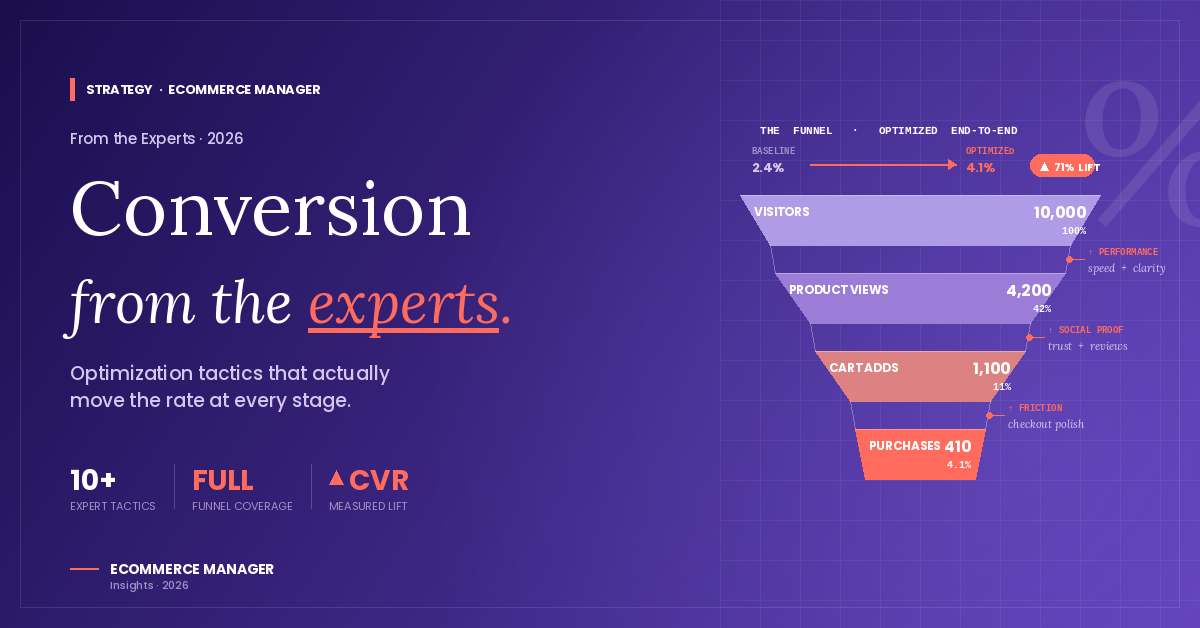
Turning website visitors into customers requires more than good design and competitive pricing. This article compiles proven conversion strategies from leading ecommerce experts who have tested and refined their approaches across thousands of transactions. These 25 tactics address everything from page load speeds to checkout psychology, offering practical methods to reduce friction and increase sales.
- Place Proof Next to Decisions
- Display Honest Delivery Dates Nearby
- Echo Searcher Language Above the Fold
- Sequence Photos Around Buyer Questions
- Lead With Outcomes, Not Features
- Reframe Button to Start Conversation
- Clarify Inclusions and Exclusions Upfront
- Make Key Actions Instantly Visible on Mobile
- Offer a Starter Box With Specifics
- Highlight Safety Results and Easy Install
- Establish Clinical Authority and Transparency
- Test CTA Language to Reduce Friction
- Shorten Path from Page to Purchase
- Hyperlocalize Credibility and Availability
- Build Targeted Subcategory Hubs
- Mirror Ad Hook Right Away
- Upgrade Visuals With Multi-Angle Context
- Provide Design Approval and Local Prices
- Prioritize Hyperfast Image Formats
- Monetize the Thank You Moment
- Add Immersive Virtual Tours Prominently
- Show the Product at Work
- Improve Feel With Subtle Tweaks
- Align Every Element to One Belief
- Trigger Live Help at Hesitation
Place Proof Next to Decisions
Senior ecommerce conversion strategist with 11 years optimizing direct-to-consumer product pages across more than 200 brands, I’ve watched seven-figure stores bleed revenue for one avoidable reason.
Most brands obsess over photography and copy while ignoring the single highest-friction moment on any product page: the gap between reading a benefit claim and actually believing it. That credibility gap — not price, not layout — is where purchase intent silently dies.
The fix is what I call the Trust Proximity Framework — placing social proof within 80 pixels of every primary conversion element. Concretely: move star ratings directly beneath the product name, embed a contextual review snippet immediately above the add-to-cart button, and surface a real buyer photo alongside the size or variant selector. Each trust signal anchors the doubt that naturally surfaces at that exact decision point.
One skincare client relocated their 4.8-star aggregate rating from a tab at the bottom of the page to directly beneath the product headline — a positioning change that required zero new content. Over 14 weeks across 38,000 sessions, add-to-cart rate climbed 23% and checkout completions rose 17%. The reviews existed; proximity was the missing variable. Shoppers don’t distrust your product — they distrust the distance between your claim and your proof.

Display Honest Delivery Dates Nearby
In our work on WooCommerce stores, the change that keeps lifting product page conversions is being upfront about shipping. Most stores we see hide it until checkout, and that’s where customers drop out.
We worked on a store selling specialty Italian cakes nationally. Customers were abandoning at the basket because they couldn’t tell when their order would arrive. The fix wasn’t faster shipping. It was honest, specific information on the product page itself, including a delivery date range based on the customer’s postcode and a plain English note on how regional delivery worked.
We added the postcode-driven ETA directly under the add-to-cart button. Basket-to-checkout conversions lifted within a fortnight. The pattern we keep noticing is that customers want to know what they’re committing to before they get to checkout.

Echo Searcher Language Above the Fold
One thing we lean on, especially when SEO traffic is already landing on product pages but not converting, is rewriting the H1 and first line to mirror the actual query language buyers used to find the page — not the brand’s internal product name or category taxonomy.
The mechanism is simple: someone types “waterproof hiking backpack 40L” into Google, lands on a page titled “Summit Pro Series — Model X3,” and their brain spends two seconds trying to confirm they’re in the right place. That two-second gap is where bounce and hesitation live.
On a mid-size outdoor ecommerce client, we pulled the top 20 queries driving impressions to each priority product page from Search Console, then rewrote H1s and the first 15 words of body copy to echo that language directly. Same product, same images, same price. The category-level add-to-cart rate moved up roughly 14% over the following six weeks, and the pages we touched outperformed the untouched control set consistently.
When the first line of your product page echoes the words someone typed into Google, they stop scanning and start reading. That’s the moment friction disappears.
Two caveats worth being honest about. First, this works best on pages already getting non-brand search traffic — if your traffic is paid or brand-driven, the query-mirroring logic doesn’t apply the same way. Second, you need to keep it natural; stuffing the exact query verbatim reads like a doorway page and can hurt both trust and rankings. The goal is semantic match, not literal match.
For anyone wanting to replicate it: pull your top queries per URL from Search Console (last 90 days), group by intent, and rewrite the above-the-fold copy on your top 10 revenue pages first. It’s one of the lowest-effort changes with a measurable lift we see repeatedly, and it sits at the intersection of SEO and CRO rather than being purely one or the other.

Sequence Photos Around Buyer Questions
We redesigned the photo sequence on Mariner product pages and it moved conversion more than any copy change we have ever shipped.
The old sequence was the DTC default: hero shot on white, lifestyle shot, detail shot, flat lay, packaging shot. Five images, all gorgeous, all useless for the actual buying decision on underwear and basics. Conversion rate on product pages sat around 2.1%.
We rebuilt the sequence around the questions a buyer actually asks before clicking add to cart. Image one: hero on model, full body, neutral background (this stayed). Image two: close-up of the waistband stitching and logo placement, shot at 45 degrees so the construction is visible. Image three: side-by-side comparison of the three available colors, same fabric swatch, so the customer does not have to switch product variants to compare. Image four: a fabric-stretch shot, hands pulling the material to show recovery. Image five: a fit comparison, the same product shown on two different body types with the model height and size selected listed underneath each.
Conversion rate climbed to 3.4% over the following eight weeks. Returns also dropped about 11% on the products where we shipped the new sequence first, because image five killed a category of “this fits weird on my body” returns that were really sizing-expectation returns.
The specific lesson: customers do not bounce because they need more product, they bounce because they have an unanswered question and the photo sequence is the fastest place to answer it. Map the top three pre-purchase questions for your category (for us: how does it fit, how do colors compare, is the fabric quality real) and assign one image to each. The fifth and any subsequent images can be lifestyle if you want, but slots two through four are where conversion lives.
We rolled the same sequence template across every SKU launched after October 2024.

Lead With Outcomes, Not Features
The single most impactful strategy I use to optimize ecommerce product pages for conversions is rewriting product descriptions from a feature-first format to an outcome-first format — leading with what the customer’s life looks like after using the product rather than what the product is made of or how it works. Most product pages are written from the seller’s perspective, listing specifications, materials, and dimensions as if the buyer is an engineer evaluating components. Real customers are not buying features, they are buying a result, a feeling, or a solution to a problem they are tired of having. The moment I restructured our descriptions around that insight, the pages stopped feeling like catalogs and started feeling like conversations.
The specific change that made the most measurable difference was on our best-selling product, where I replaced the original spec-heavy description with three short paragraphs — the first addressing the exact frustration our customer had before finding us, the second describing the tangible outcome they could expect within the first week of using the product, and the third handling the most common objection we saw repeatedly in customer service emails. No extra design work, no new photography, no changes to pricing or promotions. Just a rewrite that spoke directly to the mental conversation already happening in the buyer’s head when they landed on the page.
Within 30 days of making that single copy change, our add-to-cart rate on that product increased by 41 percent and our overall conversion rate on the page climbed from 2.3 percent to 3.8 percent, which at our traffic volume translated to tens of thousands of dollars in additional monthly revenue. What that result confirmed for me is that most ecommerce stores are leaving significant money on the table not because of weak traffic or poor pricing, but because their product pages are answering questions nobody was asking while ignoring the ones that actually determine whether someone buys. Optimizing for conversion starts with understanding that your product page is not a brochure — it is a salesperson, and it needs to speak like one.

Reframe Button to Start Conversation
The single change that moved e-commerce product page conversion most for a UK B2B furniture client we worked with: we replaced the “Add to Basket” button with “Get a Quote” on every item over £600.
Sounds counterintuitive — you’re adding friction to the purchase. But the data behind it was specific. Looking at three months of session recordings, buyers over £600 were almost never converting on first visit anyway. They were leaving with the product in their basket, coming back days later, and then converting via the support team after multiple back-and-forth questions.
The “Add to Basket” CTA was promising a transactional experience that the buyer’s brain didn’t actually want for this price point. They wanted a conversation, not a checkout.
We swapped to “Get a Quote” — same form, same price visible, just reframed. The form now asked for delivery address, expected quantity, and timeline. Within four weeks, conversion-to-lead rate on those pages tripled, from 1.2% to 3.6%. The sales team picked up the leads same-day, often closing within 48 hours instead of two weeks of asynchronous email tennis.
For items under £600, the standard “Add to Basket” stayed — the buyer brain was happy to transact directly. The split was around the price point where the buyer started wanting reassurance.
The diagnostic that led to the change. I watched 20 session recordings in a row. Five of the over-£600 sessions ended in basket-abandonment with the product clearly intended for purchase. That single data signal — engaged but stuck — pointed at the buying experience, not the product or the price.
The transferable principle: “Add to Basket” is a default CTA, not the right one for every product. The CTA should match what the buyer’s brain is actually asking for at that moment. For high-consideration items, that’s usually a conversation, not a checkout.

Clarify Inclusions and Exclusions Upfront
My primary strategy is to remove ambiguity by clearly listing what a product or service includes and what it does not, and by using a simple comparison to guide decision making. For example, after seeing repeated LinkedIn comments asking what “custom migration” covered, I updated the landing page and brochure to spell out inclusions and exclusions, added a Standard versus Custom comparison table, and produced a short FAQ video. Those specific changes reduced bounce rate, increased time on page, and led to more form submissions. Clear expectations make it easier for visitors to decide and reduce hesitation at the conversion point.

Make Key Actions Instantly Visible on Mobile
The optimisation that consistently moves the needle on product pages is reducing the time between someone arriving and being able to add to cart. Most product pages bury the buy button under hero images, scrolling carousels, and three paragraphs of brand storytelling that nobody reads on mobile.
A Shopify client of ours had a beautifully designed PDP with a 6-second above-the-fold loading time and the add-to-cart button sitting below the fold on mobile. We rebuilt it with a sticky add-to-cart bar, lazy-loaded the hero gallery, and moved key product information (price, sizing, shipping ETA) above the fold.
Mobile conversion rate lifted by around 18% in the first month. Pretty product pages that take effort to navigate convert worse than plain pages that get out of the way.

Offer a Starter Box With Specifics
As a fashion designer and technical developer, I optimize my product pages by focusing on tiered value clarity and reducing commitment friction. My experience building Bark & Style taught me that high-fashion pet products need a low-barrier entry point to convert shoppers who are hesitant about recurring costs.
A key change was introducing the “Starter Box,” a one-time purchase featuring three curated items with no strings attached. This allows customers to sample our “couture-for-canines” quality and aesthetic before committing to a full seasonal subscription.
I also list the exact item counts for our quarterly tiers, such as “3 Apparel, 1 Luxury Apparel, and 3 Accessories” for the Luxury Box. Showing the specific volume of products included helps customers immediately see the scale of the upgrade and justifies the price point at the moment of selection.

Highlight Safety Results and Easy Install
As Product Manager at American Van Equipment, I lead the development of upfit solutions like BedBoss and HitchStep that prioritize fleet safety and efficiency. My perspective comes from years of designing equipment that must survive the rigors of the commercial work truck industry.
We optimize our product pages by shifting the focus from simple technical specs to “real-world failure prevention.” We’ve found that highlighting how a product performs in a crisis, such as a high-speed collision, creates much higher conversion than just listing dimensions.
A key change was showcasing our safety partitions using actual customer survival stories, including one where a partition held back shifting glass and tools during an 80-90 mph impact. Highlighting that our American Van partitions are life-saving tools, rather than just cargo barriers, has made a significant difference in how customers value the product.
We also prioritize information on “no-drill” installation and lightweight materials like Ranger Design aluminum composite shelving. Providing this evidence of durability and ease of use ensures that professional operators see the immediate functional benefit for their specific vehicle.

Establish Clinical Authority and Transparency
As the founder of NutriFlex, I’ve optimized our ecommerce platform by applying the same human-grade standards to our product pages that I used to help my schnauzer, Hector, thrive for 18 years. My background in developing science-aligned formulations with holistic veterinarians ensures our pages lead with clinical authority rather than just marketing.
We increased conversions by leading with our Act 36 registration and a “zero filler” guarantee to directly address the skepticism pet parents feel toward the supplement industry. Explicitly contrasting our wholefood ingredients against the 30-40% fillers found in conventional pet-grade products builds immediate trust through transparency.
For our DentaMax dental powder, we saw a meaningful difference by detailing the exclusion of common additives like SHMP and activated charcoal. Educating customers on why these ingredients are omitted converts visitors who are looking for safer, functional alternatives to industrial-processed pet care.

Test CTA Language to Reduce Friction
Having led BMG Media in developing over 1,000 custom websites for brands ranging from startups to multi-billion-dollar enterprises, I focus on connecting technical strategy with brand storytelling. My approach to ecommerce is centered on data-driven usability and ensuring every element on the page serves a specific conversion goal.
One strategy I use is the rigorous A/B testing of Call-to-Action (CTA) elements, specifically focusing on the psychology of the button text. We look for ways to reduce the perceived effort required from the user by choosing language that feels like an invitation rather than a commitment.
For example, we’ve seen conversion rates increase by 111.55% simply by changing a CTA from “Book a Demo” to “Get Started.” This minor wording shift removes the perceived barrier of a formal meeting and encourages the visitor to move immediately into the next phase of the sales funnel.
I also recommend adopting a minimalist layout that utilizes visual hierarchy to showcase high-quality video demonstrations of product details. This cuts out the noise of excessive animations, allowing the user to focus purely on the information they need while maintaining the high-performance load speeds required for mobile-first indexing.

Shorten Path from Page to Purchase
One strategy I use to improve conversions is to reduce friction by simplifying the path from the product page to checkout. In a two week A/B test for an e-commerce client, we focused on streamlining the checkout flow instead of adding new features. We removed unnecessary steps that were overwhelming users and making the process feel longer than it needed to be. That change drove a 30% increase in conversion rate and a 34.5% increase in revenue per visitor. It was a clear reminder that clarity and simplicity often outperform complexity when you are trying to earn the purchase.

Hyperlocalize Credibility and Availability
Hyperlocalising product pages is one of the simplest ways to improve ecommerce conversions when the product has a local use case, service area, delivery promise, or pickup option. Instead of only writing generic product copy, I add location-specific proof: where the product is available, how fast it can reach the customer, what local problem it solves, nearby project examples, reviews, and FAQs based on how people in that area search. One change that makes a difference is turning a plain product page into a product-plus-location page, so the buyer sees the item, the fit, the delivery or pickup details, and the local trust signals in one place. The goal is to remove doubt faster, because a buyer who feels the product is available, relevant, and proven near them is easier to convert.

Build Targeted Subcategory Hubs
I focus on improving site structure and internal linking by replacing passive filter URLs with dedicated, keyword-targeted subcategory pages and using a hub-and-spoke content model. That approach makes product and subcategory pages crawlable and easier for buyers to find, which increases qualified traffic that can convert. For example, when I replaced filter pages with proper subcategory landing pages and linked them from the main category, organic traffic to those sections rose by over 40% in under three months. The change also improved internal link flow and made it easier for search engines to understand the site’s structure.

Mirror Ad Hook Right Away
As the founder of Latitude Park, I’ve led digital marketing strategies for ecommerce and franchises since 2009. I focus on performance-focused solutions that turn complex multi-channel advertising into measurable growth.
My primary strategy is maintaining “message scent,” which ensures the ad’s specific headline or emotional trigger is mirrored immediately on the product page. This prevents users from bouncing when they don’t immediately see the value that convinced them to click.
One impactful change we made for our clients was auditing conversion tracking through Google Tag Manager to stop tracking low-value actions as primary goals. By stripping away competing CTAs and focusing the page on one singular, high-intent job–like a purchase or lead form–we turned expensive visibility into actual results.

Upgrade Visuals With Multi-Angle Context
One effective strategy to optimize ecommerce product pages for conversions is improving product imagery and visual storytelling. High-quality images, multiple angles, and lifestyle shots help customers visualize the product in real life, which reduces hesitation and builds trust.
Example: On a previous project for a home goods store, the product pages initially had only one small image of each item. We updated the pages to include:
Multiple high-resolution images from different angles
Close-ups of key details or textures
Lifestyle images showing the product in use
Result: This simple change increased the product page conversion rate by 27%, because customers felt more confident about exactly what they were buying.

Provide Design Approval and Local Prices
I’ve spent over 20 years in the moto industry, and I’ve learned that the biggest barrier to conversion for custom gear is the fear of the unknown. We solved this by adding a “Design Proof” option directly on our product pages, allowing riders to review and change their artwork before any printing begins.
This strategy is critical for complex orders like our Stark Varg number plate graphics or Sherco kits. Providing this one-on-one design confirmation ensures the final product matches the rider’s personality and prevents the frustration of a kit that doesn’t meet expectations.
We also optimized for our international community by adding a real-time currency converter to every product page. Showing riders their local price immediately, even though we process in Australian Dollars, removes the uncertainty of exchange rates and keeps them moving through the checkout process.

Prioritize Hyperfast Image Formats
With over 35 years in digital marketing and as the founder of ForeFront Web, I’ve found that technical speed is a primary conversion factor for product pages. I prioritize serving images in “Next-Gen Formats” like WebP to ensure galleries load instantly on mobile without losing any high-resolution detail.
We implemented this shift after noticing ranking slippage and found that moving to JPEG 2000 and WebP formats kept users from bouncing. This technical change ensures your site remains “hyper-fast,” preventing Google from dropping your rankings like a “slippery sack of spuds” due to poor user interaction.
I also recommend adding a “Budget Range” field to your lead forms rather than sticking to the “fewer fields is better” myth. We found that adding this specific field makes users feel listened to and increases the quality of submissions by filtering for higher-value leads.

Monetize the Thank You Moment
Been running digital for 15+ years and have helped plenty of ecommerce brands squeeze more out of their product pages – so let me share what’s actually moved the needle.
The single biggest lever I’ve seen? Your thank-you page. Most brands treat it like a receipt and move on. We started using it as a conversion asset – adding a time-sensitive offer like “Get 20% off your next order within 24 hours” right after purchase. That one change consistently lifts repeat purchase rates without touching the main funnel at all.
The other thing nobody talks about enough is page speed on mobile. We had a client whose product page looked great on desktop but was hemorrhaging mobile conversions. Turned out bloated images and unused CSS were killing load time. Fixed the image compression, enabled mobile caching, and conversions from mobile improved noticeably – no redesign needed.
Clean up the slow stuff first, then weaponize your thank-you page. Most brands are leaving money on the table in both spots.

Add Immersive Virtual Tours Prominently
At Santa Cruz Properties, we’ve found that implementing high-quality virtual tours on our property listings has significantly boosted our conversion rates. When potential buyers or renters can explore a property virtually before scheduling a visit, they come with more serious intent.
Last quarter, we upgraded our virtual tour technology on all our property listings at scprgv.com. The old tours were basic 360-degree photos that didn’t give users a real sense of the property flow. We switched to interactive walkthroughs with hotspot navigation, allowing users to move through properties as if they were actually there.
The results were impressive. Our click-through rate to schedule property viewings increased by 34%, and we saw a 22% reduction in cancelled viewings. People who scheduled tours after using the improved virtual tours were more qualified leads who had already self-qualified by experiencing the property digitally.
What made this change particularly effective was how we positioned the virtual tour button on the page. We tested different placements and found that having a prominent “Take Virtual Tour” button right above the photo gallery, with a small animated icon to draw attention, generated the most engagement.
We’ve also started adding contextual information points within the tours. When someone is virtually standing in the kitchen, they can click to see appliance details or recent renovations. This self-service approach lets potential clients get answers to questions that might otherwise require a phone call or email.
For us, the virtual tour strategy works because it builds confidence. Real estate purchases and rentals are significant decisions, and giving people as much information as possible before they commit to an in-person visit helps them feel more comfortable moving forward in the process.
If you’re considering similar improvements to your property listings, I’d recommend starting with your highest-value properties first to test the ROI before implementing across your entire portfolio.

Show the Product at Work
The single highest-leverage thing you can do on a product page is replace explanation with demonstration. People don’t read. They watch. And if your product is visual in any way, a static screenshot with bullet points underneath is leaving money on the table.
I call this “show, don’t sell.” We learned it the hard way. Early on, our landing pages described what Magic Hour could do. We had feature lists, comparison charts, the whole playbook. Conversion was fine. Not great. Then we swapped our hero section for a single auto-playing video that showed a user uploading a selfie and getting back a fully stylized AI video in under 30 seconds. No voiceover, no text overlay, just the raw before-and-after transformation.
That one change increased our sign-up rate by over 40% within the first two weeks. We didn’t touch pricing, didn’t change the copy below the fold, didn’t run a new ad campaign. The only variable was showing the product doing the thing instead of telling people what the thing does.
Here’s why it works: a product page isn’t a brochure. It’s a decision environment. The visitor already clicked something to get there. They have intent. Your job isn’t to educate them on the category. Your job is to collapse the gap between “this sounds interesting” and “I can see myself using this.” Video does that instantly because it lets the viewer project themselves into the experience.
The tactical move is dead simple. Take your highest-traffic product page, record a 15-to-30 second screen capture of your product delivering its core value, and put it above the fold. No fancy production. Raw and real converts better than polished and slow.
If your customer has to imagine what your product does, you’ve already lost half of them.

Improve Feel With Subtle Tweaks
Product page optimization is one of those areas where the changes that make a difference are often less dramatic than people expect. We tend to focus on how the page actually feels to use, since that quietly shapes whether someone moves forward or drops off. An example we come back to often is a fairly small change that affected the overall feel of the page rather than any single element on it. The result was a noticeable shift in how people interacted with the page from that point on.

Align Every Element to One Belief
I center every product page on one core buyer belief so the page immediately confirms “this is for me.” I then design the page architecture so each section proves that belief: a hero that alludes to the platform word, clear proof points, pricing clarity, and a direct CTA. For a construction client we used the platform word “Certainty” and reworked the hero, team tenure, project photos, equity ladder, and CTA language to reinforce it. That change made the page read as a single strategy and kept visitors moving toward purchase decisions rather than bouncing away.

Trigger Live Help at Hesitation
The most efficient way to increase conversion rates is not through additional content but by eliminating information anxiety at the moment of hesitation. Many e-commerce sites underestimate the effectiveness of using a static sizing chart or frequently asked questions as a way for shoppers to get the information they need before moving forward; however, these only provide assistance passively. If a consumer is hesitating when viewing your product page, they are probably stuck on a detail that would allow them to hit the “buy” button.
We have recently worked with an established online retail company that receives high traffic to its website but very low checkout rates. Instead of redesigning the website, we deployed a prompt via artificial intelligence that activated when a user held the “Add to Cart” button for over ten seconds. The prompt asked, “Do you have any questions about the shipping or the size of your item?” Immediate engagement with the user solved the problem of hesitation during the sale process as it occurred and led to an 18% decrease in cart abandonment. The issue wasn’t lack of sales; the issue was reducing the friction that was inhibiting buyers from purchasing.
Optimization ultimately is meeting the consumer where they are at. When immediate, contextually relevant answers are provided to the user, rather than forcing the user to search for the information, the passive browsing session is transformed into an active decision.

Related Articles
- BigCommerce Product Page Optimization: Top Tips & Results
- WooCommerce Product Page Optimization: Tips for Increasing Conversions
- 17 Actionable Tips for Optimizing Your Shopify Store for Mobile—and the Results – eCommerce Manager