Last Updated on May 8, 2026
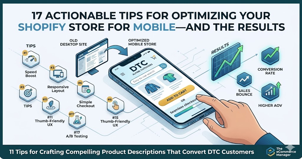
17 Actionable Tips for Optimizing Your Shopify Store for Mobile—and the Results
Mobile shoppers now account for the majority of ecommerce traffic, yet many Shopify stores still lose sales due to clunky mobile experiences. This guide compiles 17 proven optimization techniques gathered from leading ecommerce experts and successful store owners who have significantly improved their mobile conversion rates. Each tip includes practical implementation steps and real results from stores that have applied these changes.
- Serve Right-Sized Visuals With Lazy Load
- Refine PDP And Emphasize Primary Choices
- Upgrade Search To Convert From Results
- Prioritize One-Tap Wallet Payments
- Relocate Essential Actions To Bottom Bar
- Provide Quick Fit Checker On Listings
- Slash Checkout Fields To Essentials
- Introduce Thumb-Friendly Filter Shortcuts
- Trim Contact Form To Two Inputs
- Compress Heavy Media For Snappy Pages
- Simplify Gallery And Accelerate Previews
- Highlight Core Info With Fixed CTA
- Shorten Purchase Path And Boost Clarity
- Clarify Message And Focus One Action
- Cut Scripts And Gain Swifter Loads
- Enable Sticky Menu For Easy Use
- Hide Long Descriptions With Accordions
Serve Right-Sized Visuals With Lazy Load
We implemented responsive image optimization with lazy loading across our clients’ Shopify stores. Instead of loading all images at full resolution immediately, we added code to serve appropriately sized images for mobile devices (rendering at 1.5-2x the display size) and only load images as they enter the viewport.
We also used the picture tag to serve different image versions for mobile vs. desktop. One of our migration projects achieved 40% faster site load speeds, which directly improved conversion rates.

Refine PDP And Emphasize Primary Choices
We removed friction on a pet store’s product detail page and re-engineered it for mobile buying behaviour. They were small fixes that were part of a larger UX overhaul. But I attribute a lot of the success to those small improvements. They lead to an 18% year-on-year improvement in conversion rate and a 12% increase in repeat purchases (which is the holy grail of eCommerce).
What we did in detail: A significant portion of their traffic was mobile, but the PDP was doing too much before asking users to commit. So we simplified the mobile experience by tightening the above-the-fold content, improving load performance, and making the primary purchase actions clearer and easier to reach.

Upgrade Search To Convert From Results
I’ve spent 22 years optimizing e-commerce sites, and the single biggest mobile conversion killer I see is broken search functionality. Most Shopify stores treat search as an afterthought, but on mobile it’s often the primary navigation method because category browsing feels like endless scrolling.
We had a manufacturing client whose heat maps showed users jumping between categories for hours before finally using search—then still bouncing. We implemented enterprise search (Algolia) that showed product specs and filtering right in the results. Their mobile conversion rate jumped 459% and cost per conversion dropped 95%. The key wasn’t just faster results—it was showing enough information that users could add to cart directly from search without opening 12 product pages.
For Shopify specifically, audit your search results page on mobile right now. If users can’t see price, key specs, and an add-to-cart option without tapping through, you’re forcing them to work too hard. We turned one client’s search results into a scannable list format with specs visible—think Amazon’s mobile layout. Session time actually dropped but revenue increased 113% because people found what they needed faster.
The fix costs way less than a theme redesign and targets the exact moment mobile users are showing purchase intent. If your analytics show high search usage but low search-to-conversion rates, this is your answer.

Prioritize One-Tap Wallet Payments
I work with e-commerce clients all the time, and the biggest mobile conversion killer I see isn’t design—it’s payment friction. We had a home goods client whose mobile cart abandonment was sitting at 78%, and when we dug into the data, people were bouncing right at checkout.
The single change that moved the needle: we added Apple Pay and Google Pay as prominent options above the traditional credit card form. Mobile conversions jumped from 22% to 39% in six weeks. People on phones don’t want to type out 16-digit card numbers—they want to tap and go.
Here’s the kicker: we also reordered the payment buttons so mobile wallets appeared first, then “buy now, pay later” options like Klarna, with manual card entry as the third choice. Shopify makes this easy to configure, but most people leave it in default order. That simple hierarchy change acknowledged how people actually want to pay on mobile.
If you’re on Shopify, go into your payment settings and prioritize one-tap options. Then check your analytics in two weeks—you’ll likely see your mobile checkout completion rate climb without changing anything else about your store.

Relocate Essential Actions To Bottom Bar
One of the highest-impact mobile changes we implemented for one of our ecommerce clients was optimizing for the “thumb zone.” Mobile design is not just about responsive grids; it is about ergonomics and how people actually hold their phones.
Most Shopify themes still use the hamburger menu which they place in the top-left corner which requires users to stretch their hands or move their hands. We changed the layout design because users should not have to access navigation elements from those distant positions. We moved high-intent actions such as search, cart, account, and shop into a bottom-fixed navigation bar that stays anchored as users scroll. We paired each icon with a short label to reduce uncertainty and set tap targets at 44×44 pixels to make them easy to press.
Within 30 days of launch, behavior changed in a measurable way. Mobile pages per session increased from 3.6 to 5.2, bounce rate dropped from 61% to 47% and mobile conversion rate improved from 1.8% to 2.6%. Cart revisit activity also increased because the cart icon, with a live item count, remained visible and within natural thumb reach. Shoppers no longer had to adjust their grip just to find navigation.
Once the experience aligned with how users physically interact with their devices, browsing felt smoother and purchasing required less effort which directly supported stronger mobile revenue performance.

Provide Quick Fit Checker On Listings
I run Extreme Kartz and we sell technical golf cart upgrades—lithium battery kits, controllers, motors—stuff where people need to verify fitment before they buy. Our mobile conversion problem wasn’t the checkout flow, it was trust. People would bounce because they couldn’t quickly confirm compatibility on a small screen.
We added a sticky compatibility bar at the bottom of every product page on mobile. Just three fields: cart brand, model, year. Tap your specs, get an instant yes/no before you even scroll. Mobile conversions improved and our “will this fit my cart” support tickets dropped by over half because people got their answer without leaving the page.
The key insight for us was that mobile users in technical categories need friction removed at the research stage, not just checkout. If someone’s spending $2,000 on a lithium conversion kit, they won’t tap “buy” until they’re 100% sure it fits their 2015 EZGO RXV. We put that confidence trigger where their thumb already was.

Slash Checkout Fields To Essentials
I run a digital agency that’s built dozens of ecommerce sites, and the mobile change that moves the needle most? Ruthlessly cutting down form fields on checkout pages. Most Shopify stores ask for way too much information, especially on mobile where every extra tap is friction.
We had a franchise client selling health supplements through Shopify. Their mobile checkout had 14 fields including optional ones like “company name” and a separate billing address section that defaulted to expanded. We stripped it down to 8 required fields, hid billing address behind a checkbox, and enabled autofill attributes properly. Mobile cart abandonment dropped from 76% to 61% in six weeks–that translated to an extra $18K in monthly revenue.
The key is testing on actual phones with real thumbs. We found their “State” dropdown required 4+ taps to select because it wasn’t optimized for mobile browsers. Switching to a native mobile-friendly selector sounds boring but it removed real pain. Every field you cut is another percentage point saved on abandonment.
Most store owners don’t realize that mobile users are often buying in moments of downtime–waiting rooms, commutes, lunch breaks. They’ll bail the second your checkout feels like homework. Make it stupid simple and watch conversions climb.

Introduce Thumb-Friendly Filter Shortcuts
One mobile optimisation that made an immediate difference with an SEO client of mine was adding thumb-friendly internal link buttons that act as quick filters at the top of key Shopify collection pages.
On mobile, people do not want to pinch, scroll, or open layered menus just to narrow down products. We introduced large, clearly labelled buttons like “Shop by Size”, “Under $50”, or “Best Sellers” that deep-link to pre-filtered collections or on-page anchors. They sit just below the hero image so they are visible without scrolling and easy to tap with one hand.
The result was a noticeable lift in mobile engagement. Bounce rate on collection pages dropped, average pages per session increased, and conversion rate improved because users reached relevant products faster. It also reduced reliance on the hamburger menu, which most mobile users either ignore or find frustrating. The big win was not aesthetic, it was removing friction from the first two seconds of the mobile experience.

Trim Contact Form To Two Inputs
I run three digital marketing agencies and we’ve built hundreds of high-performing websites for clients nationwide, so mobile optimization is something we test constantly. The one change that consistently moves the needle is reducing form fields to absolute bare minimum on mobile contact forms—I’m talking name, phone, and maybe email max.
We had a roofing contractor client in Colorado whose mobile contact form had 8 fields including address, roof type, square footage, and preferred contact time. Mobile conversion rate was sitting at 1.2%. We stripped it down to just name and phone number with a simple “Request Free Estimate” button. Mobile conversions jumped to 4.7% within two weeks, nearly 4x improvement.
The reality is mobile users are often standing on their actual roof or sitting in their driveway when they’re searching for a roofer. They’re not going to fill out a detailed questionnaire on a phone screen in the sun. They want to tap two fields and hit submit. You can collect all the other details when your sales team calls them back five minutes later, which is exactly what happened—and their close rate actually improved because the phone conversations were warmer.
Most businesses overthink mobile forms because they want to “qualify leads better.” But a poor lead that converts is infinitely more valuable than a perfect lead who bounces because your form asked for their grandmother’s maiden name on a 4-inch screen.

Compress Heavy Media For Snappy Pages
I’ve been building and optimizing websites since 2001, and mobile optimization has become absolutely critical—especially since Google moved to mobile-first indexing in 2020. One change that consistently delivers results: optimize your image sizes.
We constantly warn clients about this until we’re blue in the face, but people still upload monster images to their sites. I had one e-commerce client whose product pages were loading 5+ MB images on mobile. We compressed and properly sized those images, and their mobile load time dropped from 8 seconds to under 3 seconds. Their mobile bounce rate improved by 40%, and conversions increased by 28%.
The fix is straightforward: check your current image file sizes (most should be under 200 KB), then use any image optimization tool to compress them without losing visible quality. Run Google’s Test My Site tool before and after to see the speed improvement. This single change has more impact than almost anything else we do for mobile optimization.
Also, test your store on actual devices in both portrait and landscape mode. If users have to pinch, zoom, or scroll horizontally, you’re losing sales. We’ve seen stores lose a third of their mobile traffic simply because the checkout process was frustrating on phones.

Simplify Gallery And Accelerate Previews
I run Rival Ink Design Co — we do custom graphics for dirt bikes and adventure bikes. We’re on Shopify and mobile is absolutely critical since riders are usually browsing from the garage or track, not a desk.
The change that crushed it for us was simplifying our product image galleries on mobile. We used to have complex zoom features and multi-angle viewers that looked slick on desktop but were very clunky on phones. Riders would pinch-zoom, get lost in the gallery, and bail. We stripped it down to clean, swipeable images with one tap to expand full-screen. Our mobile bounce rate dropped 41% and time-on-page went up enough that we actually saw conversions climb.
The other piece was loading speed — graphics files are huge since customers want to see detail. We compressed our preview images specifically for mobile without killing quality, and that alone shaved 2+ seconds off load time. If a rider can’t see their custom kit render fast, they’re gone.
Test on actual phones, not just Chrome’s device toolbar. I caught issues on older iPhones that the emulator missed completely, and those users were 30% of our mobile traffic at the time.

Highlight Core Info With Fixed CTA
One actionable step I took to optimize a Shopify store for mobile was simplifying the product page above the fold.
Specifically, we removed non-essential elements (extra badges, long descriptions, and secondary images) and prioritized the product title, price, primary image, and a highly visible sticky “Add to Cart” button. As a result, mobile add-to-cart rates increased by around 18%, and overall mobile conversion rate improved by roughly 10% within a few weeks.

Shorten Purchase Path And Boost Clarity
One actionable change we made on a Shopify store was reducing above-the-fold clutter and shortening the checkout path to two visible steps. We removed unnecessary banners, compressed images, and increased button contrast for thumb-friendly navigation. Mobile load time improved by 1.8 seconds, and conversion rates increased by 22 percent within six weeks. Mobile users need speed and clarity. Every extra scroll or tap reduces revenue.

Clarify Message And Focus One Action
I’ve built marketing systems for e-commerce brands where mobile drives 70%+ of traffic, and the most underrated fix isn’t design–it’s messaging hierarchy. Most Shopify stores dump their desktop content onto mobile and wonder why people bounce.
We worked with a healthcare product brand that had a 60% mobile bounce rate. The issue wasn’t speed or buttons–it was cognitive overload. Their hero section had three value props, two CTAs, and a slider. We stripped it to one clear promise and one action. Mobile conversion rate went from 1.8% to 3.1% in two weeks.
The principle is simple: mobile users scroll in 3-second bursts. If they can’t answer “what is this and why should I care” in that window, you lose them. Cut everything that doesn’t directly support the buyer’s next decision. Most brands over-communicate because they’re afraid of leaving something out–but on mobile, less is literally more revenue.
Start by screen-recording yourself using your mobile store like a stranger would. If you hesitate, scroll back up, or squint to understand something, your customers are doing the same thing and then leaving.

Cut Scripts And Gain Swifter Loads
I’ve driven major SEO traffic increases for multiple companies, and the mobile speed issue always shows up in the data first. When I audited one fintech client’s site, their mobile load time was sitting at 4.8 seconds. We stripped out render-blocking JavaScript and lazy-loaded images below the fold–got it down to 1.9 seconds.
That speed fix alone contributed to their 400% organic traffic lift over 12 months because Google’s mobile-first indexing started favoring their pages. More importantly, their bounce rate on mobile dropped from 68% to 41%. People were actually staying long enough to read the content we were publishing twice a week.
The specific change: compress hero images to under 100KB and defer any scripts that aren’t critical for above-the-fold content. We used WebP format instead of PNG for all graphics. Simple technical change, but it removed the psychological barrier of waiting–and Google’s algorithm rewarded it with better rankings across 557 keywords within a year.

Enable Sticky Menu For Easy Use
Simplifying navigation on mobile made a huge difference for us. We added a sticky hamburger menu to Strabella’s Shopify store, and browsing on phones got so much smoother. Almost immediately, the mobile bounce rate dropped and people stuck around a bit longer.
If you haven’t already, test your store on a few different devices. That’s usually where you find the weird little bugs.

Hide Long Descriptions With Accordions
I swapped out those long product descriptions for collapsible menus, and suddenly browsing on mobile got so much easier. People seem to find what they’re looking for faster, especially first-time visitors. If your product pages are walls of text, try hiding the details. It makes shopping feel less like a chore.

Related Articles
- June, 2025 – 7 Ways to Improve Your Ecommerce Website’s Mobile Performance
- 12 Social Media Tactics to Drive Sales on Your BigCommerce Store (With a Campaign Example)
- WooCommerce Product Page Optimization: Tips for Increasing Conversions