

Last Updated on July 31, 2026
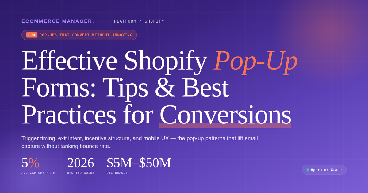
Effective Shopify Pop-Up Forms: Tips & Best Practices
Pop-up forms can be a powerful tool for growing your Shopify store’s email list and boosting conversions, but only when implemented correctly. Many merchants struggle to find the balance between capturing leads and creating a positive user experience. This guide shares proven strategies from ecommerce experts to help you design pop-ups that convert without frustrating your visitors.
- Match Incentive to Intent at Exit
- Delay Prompts Until Deep Scroll
- Replace Popups Through Conversational Discovery
- Use Two-Step Forms for Smart Triggers
Match Incentive to Intent at Exit
My best tip is to make the pop-up feel earned, not forced. A visitor shouldn’t land on a Shopify store and immediately get interrupted before they’ve even seen the product. I like using behavior-based pop-ups that appear after someone has shown intent, such as scrolling through a product page, spending time on the site, or moving toward exit. That way, the form feels more like a helpful offer than a disruption.
The type that’s worked best is an exit-intent pop-up with a simple first-purchase offer and very clear copy. For example, instead of a generic “Join our newsletter,” we used messaging that spoke to the customer’s next step: “Still thinking it over? Take 10% off your first order.” It performed better because it matched the moment. The customer was already interested, and the pop-up gave them one good reason to come back to the cart instead of leaving empty-handed.

Delay Prompts Until Deep Scroll
Timing made more difference than any copy or design change we tested, which surprised us given how much time we’d spent on the creative. We’d been triggering pop-ups at page load, which is what most Shopify themes default to and what most visitors immediately dismiss before reading anything. Changed it to trigger after someone had scrolled through roughly 60 per cent of a product page, meaning they’d demonstrated actual interest before we interrupted.
The conversion rate on the pop-up itself went from around 1.8 per cent to between 4 and 5 per cent. The type that worked best was a single-field email capture offering a discount on the first order — nothing elaborate, just less friction than forms that ask for both name and email.
Bounce rate on the pages with pop-ups actually improved slightly, which we hadn’t expected. Apparently, showing the pop-up after someone had engaged, rather than before they’d had a chance, meant fewer people left immediately.

Replace Popups Through Conversational Discovery
Building two consumer brands and leading growth at Marqo has shown me that traditional, intrusive pop-ups are a band-aid for a deeper problem: shoppers aren’t finding what they actually want. Instead of traditional discount pop-ups, the most effective approach is deploying an interactive, zero-party data conversational agent like Sibbi directly onto your storefront.
This conversational assistant acts as an active, native discovery tool that engages shoppers based on real-time catalog intelligence rather than generic timing triggers. For example, brands like Mejuri have used this AI-powered discovery approach to increase search-driven conversions by 19.8%, proving that helping users locate the right product beats interrupting them for an email address.
To make this work on Shopify, replace static lead-capture forms with a single-line-of-code conversational interface that can answer product questions, check live inventory, and assist with checkout in a single step. By helping shoppers solve their search intent immediately, you build a high-converting loop that recovers revenue and captures customer preferences naturally.

Use Two-Step Forms for Smart Triggers
The single biggest lever is trigger timing, not design. Most stores fire the popup on page load, which is why they feel intrusive and why conversion rates sit at 1-2%. I switched every client to exit-intent on desktop and a scroll-depth trigger at 55% on mobile (exit-intent doesn’t exist on touch devices, so people who copy the desktop setup get nothing on half their traffic). That one change roughly tripled opt-in rate without a single complaint about intrusiveness, because you’re only interrupting people who’ve already shown they’re leaving or genuinely reading.
The format that’s worked best for me is a two-step “yes/no” popup rather than a straight email capture. Step one asks a low-friction question tied to intent, like “Want 10% off your first order?” with a Yes and a “No, I’ll pay full price” button. Only after they click Yes do you ask for the email. It sounds like a gimmick, but the psychology is real: the micro-commitment on step one lifts completion meaningfully versus dropping an email field on someone cold, and the honest framing of the decline button keeps it from feeling manipulative.
One caveat that people often miss: whatever you capture, make sure the popup tool passes consent and the email server-side to your marketing platform, or iOS and ad blockers will quietly drop a chunk of those signups before they ever reach your list.

Related Articles
- Driving Traffic To Your Shopify Store: 16 Effective Social Media Strategies
- WooCommerce Product Page Optimization: Tips for Increasing Conversions
- Shopify Brand & Influencer Collaborations That Worked: 12 Real Examples – eCommerce Manager