

Last Updated on August 4, 2026
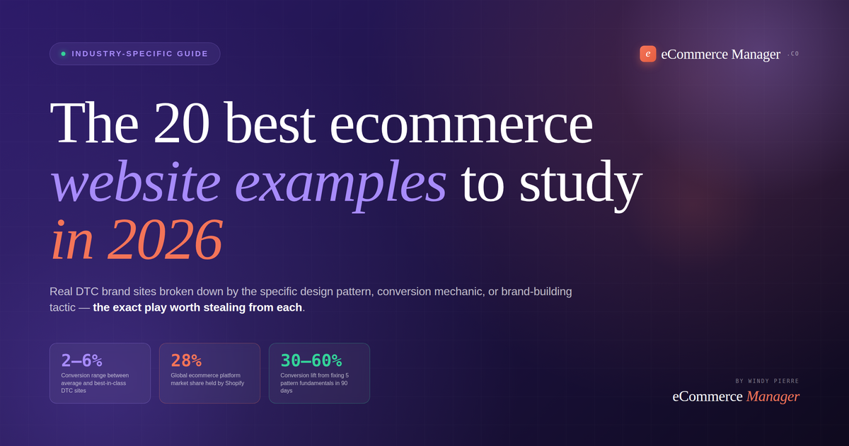
The 20 best ecommerce website examples to study in 2026 — and the specific pattern worth stealing from each
Most "best ecommerce websites" listicles show you sites and tell you they look nice. This one doesn't. Every site below is broken down by the specific design pattern, conversion mechanic, or brand-building tactic that makes it worth studying — with the honest operator take on which parts translate to your own store and which don't. Pick two or three patterns per quarter, implement, and measure.
Why "looks nice" is the wrong bar
Every "best ecommerce websites" listicle you've ever read is the same article. Fifteen screenshots of sites that look pretty. Zero explanation of what makes them work. You close the tab having learned nothing you can actually apply to your own store.
Here's the thing about studying top ecommerce sites. Aesthetic isn't the point. Aesop's site is beautiful — but beautiful is downstream of a specific set of decisions about product hierarchy, copy voice, and pacing that most brands couldn't implement even if they hired the same design agency. Glossier's site looks fun — but the fun is a byproduct of a UGC integration strategy that took years to build. When operators say "I want a site that looks like Bombas," what they usually mean is "I want to convert like Bombas," and those are completely different problems.
The 20 sites below are organized by the specific conversion mechanic or brand-building tactic each executes best. Category-defining fundamentals (Allbirds, Warby Parker, Bombas, Ridge Wallet) show what the storefront basics — product pages, size guides, trust signals, checkout — look like when executed at the highest level. Purpose-driven storytelling (Patagonia, Everlane, TOMS, Bombas) is the playbook for brands where mission and product are inseparable. Social proof and UGC-driven brands (Gymshark, Glossier, Aerie, MeUndies) show how to turn customer content into a conversion engine rather than a widget. Innovation and interactive experiences (Warby Parker, Apple, Nike, KidSuper World) push the ceiling of what commerce can be, most of it plagiarizable for smaller operators. Editorial and restraint-driven design (Aesop, Bottega Veneta, Rapha, MVMT) proves that quiet, disciplined design converts as well as maximalism when the product and audience call for it.
Pick two or three patterns from below per quarter. Implement them. Measure. That's how you build a store that converts at 4-6% instead of 1.5-2%. Not by copying screenshots.
The full comparison table
All 20 sites grouped by category, with platform, primary industry, and the specific pattern worth stealing. Full write-ups follow below.
| Brand | Category | Platform | Pattern to steal |
|---|---|---|---|
| Allbirds | Fundamentals | Shopify Plus | Benefit-led material copy |
| Warby Parker | Fundamentals | Custom | Virtual try-on integration |
| Bombas | Fundamentals | Shopify Plus | Mission-tied product page |
| Ridge Wallet | Fundamentals | Shopify Plus | Video PDP demos |
| Patagonia | Storytelling | Custom | Editorial-storefront blend |
| Everlane | Storytelling | Custom | Radical transparency pricing |
| TOMS | Storytelling | Custom | Impact-as-social-proof |
| Hims & Hers | Storytelling | Custom | Consultation-first funnel |
| Gymshark | Shopify Plus | Mobile-first UGC integration | |
| Glossier | Shopify Plus | Customer-as-hero photography | |
| SKIMS | Shopify Plus | Waitlist & launch scarcity | |
| MeUndies | Shopify Plus | Membership-as-community | |
| Apple | Innovation | Custom | Scroll-driven storytelling |
| Nike | Innovation | Custom | Video-first PDP |
| KidSuper World | Innovation | Custom 3D | 3D walkable storefront |
| Rothy's | Innovation | Shopify Plus | Sustainability calculator |
| Aesop | Editorial | Custom | Ingredient-as-content |
| Bottega Veneta | Editorial | Salesforce CC | Gallery-not-catalog |
| Rapha | Editorial | Custom | Retail + editorial + membership |
| MVMT | Editorial | Shopify Plus | Lifestyle-first hero videos |
Category-defining fundamentals
These four brands aren't the flashiest sites on this list. They're the ones that execute the storefront basics — product pages, size guidance, trust signals, checkout — at a level that separates 2% converters from 4-6% converters. If you're serious about optimizing your store, these are the first four to study.
01Allbirds
Allbirds has had a mixed few years operationally, but the storefront craft remains the textbook example every ecommerce founder should study. Product description copy leads with what the material does for the customer — "Made with tree fibre. Lightweight, breathable, silky smooth." — rather than listing what the material is. Every product page includes a specific carbon footprint number. Reviews on hero SKUs (60,000+ on the original Wool Runner) provide a credibility moat competitors can't match. The Questions section is one of the most actively used in DTC, and the size guidance is genuinely the most thorough in DTC footwear.
The site runs on Shopify Plus with sub-2-second load times. Load a product page and you'll see the pattern instantly: hero product image, benefit-led copy, carbon number, size selector with detailed fit guidance, review count with rating, and clear pricing. Trust signals cluster near the buy button rather than getting pushed below the fold. It's not flashy. It's disciplined. And discipline is why it converts.
Rewrite your product copy to lead with benefits, not features. "Made with X material" is a feature. "Lightweight, breathable, silky smooth" is a benefit. Test the swap on your top 3 SKUs and measure conversion. This single change moves more conversion than most brands realize.
Warby Parker solved a problem most ecommerce founders never think about: how do you sell a high-consideration product (prescription glasses) online when customers desperately want to try before they buy? The answer is a virtual try-on tool built directly into the product page — not hidden behind a modal or a separate app. On the product page, alongside the standard image gallery, the "Try On" button opens a phone-camera AR experience that lets shoppers see the frames on their own face in real time. It's the most seamless implementation of AR try-on in ecommerce, and it dramatically reduces the return rate versus buying blind.
Beyond the try-on, Warby Parker's product pages are a masterclass in reassurance around the buy button: free shipping, free returns, lens inclusion details, prescription information, review counts, width selection, and clear pricing all cluster within a single scroll. Everything the buyer needs to overcome anxiety is right where they're deciding.
Identify the top 3 buying anxieties your customers have (fit, quality, delivery, returns) and cluster the answers within one scroll of the buy button. Not on a separate FAQ page. Not in a footer. Right there where the purchase decision happens. Sizing charts, guarantee details, and shipping info near the button convert better than the same information three clicks away.
03Bombas
Bombas built a $100M+ brand by turning basics (socks, underwear, T-shirts) into a mission-driven purchase. The site design perfectly mirrors the brand — playful, warm, energetic, with an "impact counter" showing pairs donated to homeless shelters ticking up in real time on the homepage. Product pages balance humor ("Take a load off, feet") with genuine spec depth on cushioning, wicking, and fit. The mission is baked into the shopping flow rather than confined to a separate About page.
What separates Bombas from other mission-driven brands: the mission never gets in the way of the product story. The site tells you why you want the socks first (comfort, fit, durability) and then reminds you that buying them also donates a pair. That order matters. Brands that lead with mission and then get to product convert measurably worse than those that lead with product and then reveal mission as reinforcement.
Lead with product benefits, then reveal mission as reinforcement. Customers buy the product because they want the product. Mission converts them from purchase 1 to purchase 4. Reversing that order (mission first, product second) sounds noble but converts worse.
Ridge Wallet built a nine-figure DTC business selling a single product category (minimalist wallets) by treating product page video as a first-class asset rather than an afterthought. Every product page opens with a 15-30 second demo video showing the wallet in real use — cards inserted, cash folded, RFID demonstrated. The video sells the product harder than any static image sequence could, and it does the heavy lifting on the specific buying anxiety (does it actually fit my cards? does it work with cash?) that stops most wallet purchases.
Beyond video, Ridge's site is a case study in one-category focus. There's no wandering into adjacent products. There's no dilution of the value proposition. Every element of the site — hero, category pages, product pages, reviews, upsells — reinforces the same message: this is the wallet that fixes what's wrong with your current wallet. That focus is why it converts.
Add a 15-30 second demo video to your top 3 SKU product pages. Show the product in use, not just from angles. Show the specific problem it solves. Video PDP conversion lifts of 20-40% are common when the video actually demonstrates the product rather than just showing a rotating hero shot.
Ready to implement these patterns on your own store? The right agency partner accelerates the timeline dramatically.
Browse our directory of vetted DTC agencies specializing in Shopify Plus optimization and conversion rate work.
Purpose-driven storytelling
These four brands turned mission, transparency, and category-adjacent editorial content into a competitive moat. They're the case studies for how to build a brand where the story is the product's most-visible feature and it still converts at DTC-benchmark rates.
Patagonia's site is the case study for what happens when editorial content and commerce truly merge rather than existing on separate pages. Product pages tell you where the fabric came from, who made it, and what environmental impact went into the piece — as part of the buying flow, not tucked into a corporate responsibility section. The Worn Wear program (secondhand Patagonia gear) is integrated directly into the main navigation, not hidden. The Stories section (activist journalism, film, essays) sits alongside product categories in a way that treats storytelling as commerce rather than as marketing garnish.
What makes this hard to copy: it only works if the brand has actually done the work behind the storytelling. Patagonia can integrate activism into commerce because they've been genuinely activist for decades. Brands attempting the pattern without the underlying substance land as performative and lose the trust they were trying to build. Editorial-storefront blending is a commitment, not an aesthetic choice.
Weave one to two authentic story elements directly into your product page rather than confining them to your About page or blog. Where the material came from, why you chose it, what problem it solves for the wearer. Just the story, told plainly at the product-page level. Don't fake mission — but if you have one, put it in the buying flow.
06Everlane
Everlane built a category-defining brand on a single site design decision: publish the cost breakdown of every product directly on the product page. Materials cost X. Hardware cost Y. Labor cost Z. Transport cost W. Total cost is A. Our markup is B. Traditional retail markup would be C. That radical transparency in pricing was so unusual in 2015 that it became the brand identity, and the site design has been organized around that transparency ever since.
The lesson isn't that every brand should publish cost breakdowns. Most brands can't. The lesson is that a single high-conviction site design choice, executed with discipline, can become the brand itself. Everlane didn't need cool typography or aggressive color palettes — the pricing page WAS the design point of view. When your site expresses one specific belief with clarity, you don't need to compete on aesthetics.
Identify one specific belief about your product or category and design a site feature around it. Everlane's belief: pricing should be transparent. Allbirds' belief: environmental impact matters. Warby Parker's belief: trying glasses should be easy. What's yours? Pick one and build your site around it.
07TOMS
TOMS pioneered the one-for-one purchase model (buy a pair, donate a pair) and has spent a decade refining how impact reporting integrates into an ecommerce experience. The current site treats impact as social proof — after purchase, customers get impact reporting on where their donation went, which converts to email opens, repeat purchase, and word-of-mouth referral at rates typical direct-response emails can't match. On product pages, the impact call-out sits alongside product benefits rather than getting its own separate section.
What TOMS proves that most mission-driven brands miss: the impact story is most effective as a repeat-purchase and retention lever, not as an acquisition lever. First-time customers buy because the product is good. Repeat customers buy because they feel connected to the mission. Design impact into your retention flow, not just your homepage hero.
If you have any mission or impact component to your brand, integrate impact reporting into your post-purchase flow (order confirmation email, shipping notification, post-delivery follow-up). "Your purchase contributed X" hits harder in a receipt than on a homepage — and it drives measurably higher repeat-purchase rates.
Hims & Hers built a $1.5B business by inverting the standard ecommerce funnel. Instead of leading with product, the site leads with a health consultation quiz that assesses the customer's condition and then recommends products at the end. That inversion does three things: it establishes medical credibility upfront, it personalizes the recommendation which increases perceived fit, and it converts sensitive-topic browsers who wouldn't have clicked on a product page directly into buyers who've now invested time and answered questions and want to see the recommendation.
The pattern doesn't only apply to telehealth. Any high-consideration category where personalization matters — skincare, supplements, fitness gear, custom apparel — benefits from a quiz-driven "diagnose then recommend" flow. It converts browsers at rates a direct product page never will, because it builds relationship before it asks for the sale.
Add a quiz-driven recommendation flow for any product category where personal fit matters. 5-8 questions, personalized recommendation at the end, opt-in for email at the results screen. The quiz doubles as both a conversion funnel and a lead-gen tool. Conversion on quiz-driven purchase paths runs 3-5x standard product page conversion.
Social proof & UGC-driven brands
These four brands turned customer content into a primary conversion mechanic rather than a widget at the bottom of product pages. If your site treats reviews as an afterthought, these are the examples that show what happens when you don't.
09Gymshark
Gymshark is the Shopify Plus benchmark for mobile-first ecommerce execution and the case study for UGC as a conversion engine rather than a widget. Product pages integrate customer photography directly alongside professional imagery — real customers wearing the products in real settings, tagged by size and body type so shoppers can see how it fits people similar to them. The mobile experience is engineered rather than adapted from desktop: hero video that autoplays, sticky add-to-cart bar, mobile-optimized filter drawer, one-thumb navigation throughout.
The dynamic shipping bar changes based on promotions and cart value ("Add $12 for free shipping"), creating clear incentive for higher AOV. The destination selector routes shoppers to gender + fitness goal segmented views (women's leg day, men's push day, etc.), which surfaces relevance faster than a generic category grid.
Integrate real customer photos next to your product images. Not testimonial screenshots. Not stock reviews. Actual UGC of real customers using the product, tagged with size, body type, or use case. Sites doing this well convert 20-40% higher than sites relying on professional-only photography.
10Glossier
Glossier built a skincare and makeup empire by inverting who the hero of the ad is. Traditional beauty brands feature polished models. Glossier features actual customers — real faces, real lighting, real skin. The founder is deliberately hidden. Customers become the face of the brand. That inversion is executed throughout the site: product pages integrate real customer photography from Instagram, homepage hero rotates through actual customers rather than aspirational models, and the review section is designed to feel like a community discussion rather than a rating widget.
The pattern only works because Glossier had already built an engaged audience through the Into The Gloss blog before it launched product. Customer content wasn't a manufactured strategy — it was a natural extension of an existing community. Brands trying to copy Glossier without the underlying audience relationship end up with the aesthetic and none of the conversion. Community first, then product, then site design.
If you have any social community around your product, integrate that community content directly into your site. Instagram grid embedded on homepage. Customer photos in your product galleries. Real names and faces in your reviews. The specific tactic matters less than the commitment: your customers should be visible on your site as often as your models are.
11SKIMS
SKIMS pairs cultural relevance with genuinely disciplined launch mechanics that turn every product drop into an event. The site is engineered around waitlists — new colors, new categories, and restocks all route through email capture with countdown timers and sold-out flags that create legitimate urgency rather than fake scarcity. Product page thumbnails show 30+ real body types and skin tones per SKU, which does the sizing-anxiety heavy lifting most competitors handle badly.
The launch mechanic is worth studying regardless of category. SKIMS treats sold-out states as marketing rather than problems — every restock generates a wave of email opens and social buzz. The site is designed to reward customers who join the community with early access, which converts to LTV meaningfully higher than customers acquired through paid ads. Scarcity done well is a retention lever, not just a conversion trick.
Turn your best-selling SKU restocks into email-capture waitlists rather than announcements. Every out-of-stock state is a chance to add to your list. Give waitlist customers 24-hour early access to restocks. The email list you build this way converts at 3-8x standard cold traffic.
12MeUndies
MeUndies built a subscription empire on a category (underwear) most brands treat as a one-time purchase. The site design bakes membership into the buying flow rather than treating it as an upsell. Product pages compare "Member Price" vs "Non-Member Price" side-by-side, making the membership value proposition immediate. Exclusive prints ("Members Only" drops), community events, and content are integrated into the site experience, giving membership meaning beyond just a subscription discount.
The lesson for repeat-purchase categories: membership should be visible everywhere on your site, not treated as a checkout-page decision. If your product has natural repurchase (basics, consumables, subscription-relevant categories), membership is the highest-LTV mechanic available and your site should treat it accordingly.
If you have any subscription or membership option, price-compare it directly on the product page. "Member $18 / Non-Member $28" is a stronger conversion trigger than showing full price plus a subscription discount at checkout. Sites making the membership choice visible earlier convert 40-60% more subscribers.
Innovation & interactive experiences
These four brands push the ceiling of what ecommerce can be — scroll-driven storytelling, video-first PDPs, 3D storefronts, and interactive product experiences. Most of it looks unimplementable for smaller operators. Most of it is more implementable than you'd guess with the right partners.
13Apple
Apple's product pages set the industry benchmark for scroll-driven storytelling. Each product page is a long-form editorial narrative — hero video that transitions into scroll-linked animations, cinematic sequences that reveal specifications as you move down the page, and pricing/purchase controls that appear only after the story has been told. The pattern trades click-friction for narrative-immersion, which works because the products justify the storytelling depth.
What's borrowable: the underlying architectural decision to treat the product page as a narrative rather than a spec sheet. What's not borrowable for most brands: the production budget behind each frame of Apple's PDP videos. Smaller operators can copy the structure (hero video, scroll-linked reveals, purchase controls late in the flow) without matching the production polish. The pattern works because of structure, not just visual execution.
Restructure your top-selling product page as a narrative rather than a spec sheet. Hero video, then scroll-linked reveals of key benefits, then specifications, then trust signals, then purchase controls. The order matters more than the polish. Brands testing narrative-structure PDPs against spec-sheet PDPs see 15-30% conversion lifts consistently.
14Nike
Nike's product pages lead with looping athlete films rather than static hero images. That single design choice — video is the primary asset, images are secondary — changes how customers relate to the product. The shoe isn't a photograph; it's a shoe in use, on a real athlete, moving. That reframing converts differently than static-image PDPs because it demonstrates the product's context rather than just its appearance.
The pattern generalizes to any category where use-in-motion matters (apparel, footwear, tools, fitness equipment, kitchen gear). Video of the product being used converts better than static images of the product isolated. Nike's version is high-budget athlete cinema, but the underlying pattern (video-first PDP) is achievable for any brand willing to shoot decent product-in-use footage.
Make video (not photography) the hero of your top 3 product pages. Doesn't have to be cinema. Even simple product-in-use footage shot on an iPhone converts better than static hero images for physical goods. Sites making the switch see 20-35% conversion lift on video-primary PDPs.
KidSuper World is what the future of niche ecommerce looks like — a fully-3D walkable storefront that customers navigate through as if visiting a physical space. Products appear in-context as decor, art, and installations within virtual rooms. The buying interaction happens when customers click on specific items, opening standard product page overlays. It's genuinely a new category of shopping experience, and it converts because it makes browsing feel like discovery rather than catalog.
For 99% of ecommerce brands, this is aspirational rather than actionable — the production cost of a walkable 3D store runs six figures and the conversion lift is unpredictable outside of art/fashion/streetwear categories where discovery is the buying motion. But the underlying insight (make browsing feel like discovery, not catalog scanning) can be implemented at cheaper levels through better editorial curation, smaller-batch product releases, and homepage designs that feel like magazine covers rather than product grids.
Make your homepage feel like a magazine cover, not a product grid. Even without 3D, you can turn the homepage into curated discovery — one featured hero story, one editorial collection, one drop announcement, one community moment. The catalog can live inside category pages. Homepages that feel curated convert 20-40% better than homepages that feel like grids.
16Rothy's
Rothy's built a category-defining brand on knit shoes made from recycled water bottles — and made the sustainability claim tangible through an on-site impact calculator that shows customers exactly how many bottles their purchase kept out of the ocean. That specificity is why the sustainability angle works. Vague environmental claims land as marketing. A specific number ("Your order recycled 27 water bottles") lands as fact. Rothy's site is engineered to make abstract impact feel concrete.
The pattern applies to any brand with quantifiable impact — carbon reduction, water saved, materials recycled, jobs supported. The magic isn't the mission; it's the specific number attached to the individual purchase. Vague impact claims don't convert. Specific-per-purchase impact numbers do.
If your brand has any measurable impact story, translate it to a specific per-purchase number and display it on the product page. "Your purchase = X recycled bottles / Y trees planted / Z pounds of CO2 avoided." Specific-per-purchase impact numbers convert 30-50% higher than vague sustainability claims.
Ready to systematically test conversion patterns from these sites?
Use our Conversion Pattern Calculator to prioritize which of the 20 patterns above would drive the biggest lift on your specific store.
Editorial & restraint-driven design
These four brands prove that quiet, disciplined design converts as well as maximalism when the product and audience call for it. Editorial restraint is a real strategic choice, not a lack of effort — it costs as much to execute as flashy design, just in different places.
17Aesop
Aesop is the case study for editorial restraint as commerce. Product pages read like museum captions — spare, precise, elegant. Ingredient descriptions treat each botanical as if it were an important artwork with its own paragraph of history and application. The site refuses to shout. Nothing is highlighted. Nothing autoplays. The design says: this product deserves your attention, and if you don't want to give it, that's fine.
That confidence is the entire conversion mechanic. Customers buying Aesop are buying the feeling of sophistication that comes from the shopping experience itself. The design is the product's promise about what buying it says about you. Attempting Aesop's design without the premium product substance to back it lands as pretentious. But when the product genuinely justifies the treatment, restraint outperforms maximalism reliably.
If your product genuinely qualifies for premium treatment (over $100 price points, luxury or wellness category, considered purchase), test a restraint-focused product page against your current one. Longer descriptions, less color, no urgency banners, higher-resolution single hero image. For the right audience, less pressure converts higher, not lower.
Bottega Veneta's site treats commerce as a gallery experience. Products get individual attention, spread across generous white space with editorial photography rather than product-catalog imagery. Category pages don't grid — they curate. Season collections read like magazine spreads. The site refuses to feel like a store even though it functions as one, which is the luxury customer's whole preference.
What makes this pattern work: luxury customers don't respond to conversion optimization the way DTC customers do. Urgency banners, countdown timers, "17 people are viewing this" widgets, and standard trust badges all lower conversion for luxury audiences because they signal the wrong kind of brand. Restraint isn't just an aesthetic choice at this tier — it's a strategic requirement.
If you sell in premium categories ($200+ average order value, luxury or considered categories), remove standard DTC conversion tactics from your site. No urgency banners. No countdown timers. No "trending" widgets. What signals value in the fast-fashion category signals cheapness in the premium category.
19Rapha
Rapha runs three distinct businesses through one site: a retail store, an editorial cycling publication, and a paid membership club (Rapha Cycling Club). The site treats those three as peers rather than burying two of them, so a shopper can enter through a jersey and leave having joined the club. Editorial content sits alongside product categories in the main navigation. Ride reports, membership benefits, and product pages weave through the same visual language.
The multi-proposition navigation is genuinely hard to execute well. It's the single most common place where large stores get bloated and confused. Rapha earns the complexity by making each layer reinforce the others — the editorial content builds credibility that supports product pricing, the membership creates community that drives repeat purchase, and the retail catalog funds the whole ecosystem. Each layer would be weaker alone.
If your brand has both product and content (blog, community, courses), stop treating them as separate site sections. Weave them together in the main navigation. Editorial content that leads back to product converts better than either alone, but only if the connection between them is obvious in the top-level UX rather than hidden in a footer.
20MVMT
MVMT built a $100M watch business on Instagram-first marketing and translated that same sensibility into site design. Homepage hero is cinematic lifestyle video — a person wearing the watch in a real environment (rooftop bar, mountain hike, city street) rather than a product-only shot. Product pages match: lifestyle imagery of the watch on wrist in context comes before the isolated product photography. That order matters. Customers see themselves wearing the product before they see the product itself.
The pattern generalizes to any lifestyle-adjacent category (watches, apparel, home goods, accessories). Lead with lifestyle context, then reveal product detail. Customers buy the identity the product creates for them; the specific object matters less than the context in which they imagine themselves owning it.
Reorder your product page image gallery to lead with lifestyle context photos rather than product-only shots. Show someone using or wearing the product first, then reveal isolated product detail. Small SKU decision with disproportionate conversion impact — 15-25% lifts are common on lifestyle-adjacent categories.
5 patterns to implement this quarter
Studying great sites is easy. Implementing the patterns is harder. Pick two or three of these five patterns for the next 90 days, ship them, measure conversion impact, and iterate. This is the actual playbook.
Rewrite PDP copy for benefits, not features
Allbirds and Aesop set the standard. Lead product descriptions with what the material or ingredient does for the customer rather than listing what it is. Test on top 3 SKUs first, measure conversion for 30 days, then roll out to full catalog.
Cluster trust signals near the buy button
Warby Parker and Bombas execute this perfectly. Reviews, guarantee, shipping, returns, and product-specific reassurance should sit within one scroll of the buy button. Not on a separate FAQ page. Not in the footer. Right where the decision happens.
Add video to top-3 SKU product pages
Ridge Wallet and Nike prove this. Video demonstrating product-in-use converts 20-40% higher than static images alone. Doesn't need to be cinema — an iPhone-shot 15-30 second demo of your product being used is enough to move the number.
Integrate real customer photography into PDPs
Gymshark and Glossier lead this. Real customers, real body types, real skin tones alongside professional photography. Tagged by size or use case when possible. UGC integration is the single highest-ROI conversion pattern most brands ignore.
Test one high-conviction site feature
Everlane's cost transparency, Warby Parker's virtual try-on, Rothy's impact calculator. Pick one specific belief about your product and design a single feature around it. Sites with one strong point of view convert better than sites trying to be everything.
The single most common site-optimization mistake ecommerce founders make: implementing 15 patterns simultaneously and measuring none of them. You end up with a site that changed but no attribution for what moved. The playbook that actually works: pick 2-3 patterns per quarter, implement them cleanly, run A/B tests where possible, measure conversion impact for 30-60 days, then decide whether to keep, iterate, or revert. Site optimization is a compounding discipline, not a redesign event. The brands converting at 4-6% aren't running the same site they had 3 years ago — they've been shipping small, tested changes every quarter and their site has moved 60 patterns forward over that period. Yours can too.
Priority stack by revenue stage
Not every pattern makes sense at every stage. Here's the honest, stage-by-stage priority stack for which of the 20 sites above should be your primary study material based on where your ecommerce brand is today.
Nail the fundamentals
- Study: Allbirds (PDP copy)
- Study: Warby Parker (trust clusters)
- Study: Ridge (video PDP)
- Study: Bombas (mission integration)
- Focus: Copy, trust, video, one narrative
Add social proof depth
- Study: Gymshark (mobile UGC)
- Study: Glossier (customer photography)
- Study: SKIMS (waitlist mechanics)
- Study: Hims (quiz-driven funnels)
- Focus: UGC, launches, personalization
Build brand infrastructure
- Study: Aesop (editorial restraint)
- Study: Rapha (multi-proposition nav)
- Study: Patagonia (editorial commerce)
- Study: Apple (scroll storytelling)
- Focus: Point of view, community, editorial
The 20 sites above aren't a shopping list of aesthetics to copy. They're a set of specific patterns — 20 distinct conversion mechanics, brand-building tactics, and design decisions — each proven at real revenue scale by real DTC brands. Your job as an operator isn't to make your site look like Allbirds or Glossier or Aesop. Your job is to identify which 2-3 patterns from this list solve the specific conversion problem your store has today, implement them cleanly, measure the impact, and repeat. That's how you build a store that converts at 4-6% instead of 1.5-2%. Not by redesigning. By systematically compounding proven patterns.
FAQ
Great ecommerce sites in 2026 share five traits: a clear, benefit-led value proposition above the fold, product pages that lead with what the product does for the customer rather than what it is, trust signals (reviews, guarantees, shipping details) placed near the buy button rather than buried, page load times under 2.5 seconds, and checkout flows with three or fewer steps. WebMedic audit data across 80+ stores shows that fixing these five areas lifts conversion 30-60% within 90 days. Beyond those fundamentals, the best sites in 2026 are picking a strong point of view — either luxury restraint (Aesop, Bottega Veneta, Patagonia) or challenger maximalism (Glossier, Poppi, Oatly) — and executing that view with discipline. The sites losing market share are the ones stuck in the middle.
Shopify and Shopify Plus power the majority of top-performing DTC ecommerce sites. Allbirds, Gymshark, Ridge Wallet, Bombas, Rothy's, Glossier, and dozens of other featured brands run on Shopify Plus. BuiltWith data shows Shopify holds 28% global ecommerce platform market share in 2026. Beyond Shopify, WooCommerce powers a meaningful share of content-driven brands, and larger enterprises like Nike, Warby Parker, and Bottega Veneta use custom Salesforce Commerce Cloud, BigCommerce, or fully-headless architectures. The platform matters less than the execution — a well-optimized Shopify store outperforms a poorly built custom site every time.
The five conversion patterns worth copying from top DTC sites in 2026: (1) Benefit-led product copy that leads with what the material or ingredient does for the customer rather than listing what it is. Allbirds and Aesop set the standard. (2) Detailed size and fit guidance with real customer photos and questions. Allbirds' Question section and Warby Parker's virtual try-on are best-in-class. (3) Trust signals near the buy button — free shipping, free returns, guarantee, and specific reviews. Warby Parker, Bombas, and Hims all do this well. (4) Authentic social proof with real photos, real names, and verified-purchase status. Aesop, Allbirds, and Casper lead here. (5) Mobile-first checkout flows tested on real 4G connections rather than dev-tool simulations. Gymshark, Glossier, and ASOS are the benchmarks.
The best ecommerce sites in 2026 have stopped using generic 5-star widgets at the bottom of product pages and started integrating real reviews with detail and depth throughout the shopping experience. Allbirds surfaces 60,000+ reviews on hero SKUs directly on the product page with specific ratings by feature (fit, comfort, style). Glossier integrates customer photography from Instagram directly into product images. Aesop displays reviews with the full text visible plus customer name and verified purchase status. Casper offers extensive review depth with filtering by sleeper type. The pattern to steal: reviews should be a substantive part of the buying decision, not a widget that sits at the bottom of the page as an afterthought. Sites treating reviews as first-class content convert 30-50% higher than those hiding them.
In 2026, ecommerce design has split into two dominant philosophies both winning at the top of their categories. Luxury restraint (Bottega Veneta, Aesop, Patagonia) treats the storefront as a gallery — editorial discipline, generous white space, long-form product storytelling, quiet color palettes, and near-zero visual noise. It works for premium products where the buyer wants to feel sophisticated rather than sold to. Challenger maximalism (Poppi, Oatly, Glossier) treats the storefront as personality — aggressive color, bold typography, personality-led voice, and visual risk-taking that enterprise brands would never approve. It works for products where cultural relevance and voice ARE the differentiator. The middle ground — competent-but-forgettable design without a strong point of view — is where most brands lose in 2026. Pick a philosophy that matches your product and customer, then execute with discipline.

Ready to systematically ship the patterns above?
Run our Conversion Pattern Calculator to prioritize which of the 20 patterns would drive the biggest lift on your store, or browse vetted agencies that specialize in DTC conversion work.