
Last Updated on June 25, 2026
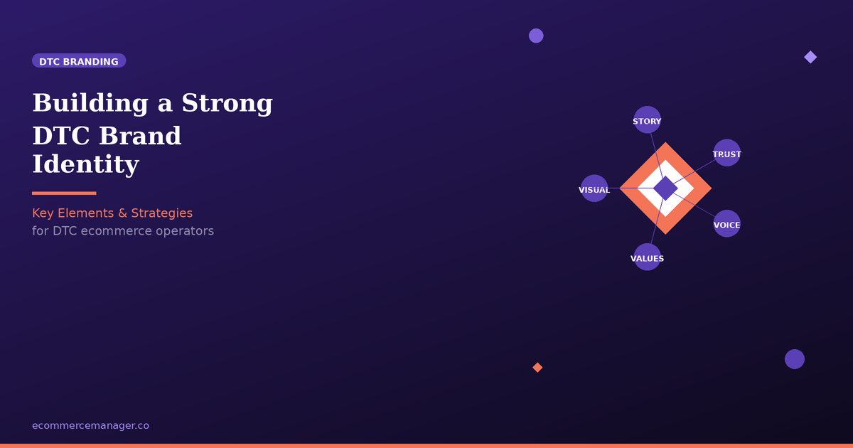
Building a Strong DTC Brand Identity: Key Elements & Strategies
Building a direct-to-consumer brand that resonates with customers requires more than just a good product—it demands a strategic approach to identity and messaging. This article breaks down the essential elements of creating a memorable DTC brand, from research and naming to packaging and voice. Industry experts share proven strategies for establishing trust, authenticity, and a cohesive brand presence that drives customer loyalty.
- Hand Lettered Art Conveys Your Mission
- Project a Cohesive Artistic Point of View
- Define a Distinct and Consistent Brand Voice
- Signal Premium and Deliver on Promise
- Anchor Every Choice in Belief
- Earn Trust through Educational Transparency
- Start with Research and Message Map
- Create Delight with Thoughtful Package Details
- Lead with Provenance and Product Integrity
- Use Story to Inspire Discovery
- Choose Descriptive Names Customers Seek
Hand Lettered Art Conveys Your Mission
The approach I take is hard to shortcut. First, decide what your brand stands for and then make every touchpoint from there prove it and build upon it. The whole reason my brand Self-Care Shirts exists is to reduce stigma around mental health and make what’s usually treated as clinical more human and approachable. That standard gets applied to literally everything I touch whether that’s product choice, design, copy, email subject lines, even how I respond to customer service messages. If at any point a touchpoint contradicts the core mission, then that’s a loss. And the mission extends to money, as well. 10% of proceeds are donated to 988 and The Trevor Project, not as a campaign but as a standing commitment. Customers can feel the difference between a value and a promotion.
The one element that has been essential for my brand is drawing hand-lettering on my designs. Each design stems from a phrase I needed to hear as I was healing, and the imperfections of drawing it by hand are kind of the whole point. It is the difference between a typed-out product and a phrase someone drew just for you. My style is also instantly recognizable and hard for competitors to copy, and it carries the brand promise well before anyone reads a single word of copy.

Project a Cohesive Artistic Point of View
One of the most important decisions I’ve made in building Drese Art was to focus the brand around a clear creative idea rather than a specific product category. We don’t sell tote bags, mugs, or laptop sleeves first—we use those products as a canvas for original artwork.
The branding element that has been most crucial for us is consistency. Whether someone discovers us through a floral tote bag, a travel-inspired canvas print, or a notebook, they should immediately recognize the same artistic point of view. That consistency extends across the artwork, website, product descriptions, photography, and brand messaging.
For direct-to-consumer brands, I think a strong identity comes from giving customers a reason to remember you beyond the product itself. Products can be copied, but a distinctive creative vision is much harder to replicate.

Define a Distinct and Consistent Brand Voice
In my opinion the strongest singular brand element is often one which a lot of brand owners overlook. This is ‘Brand Voice’. Although it may seem like a vast subject given how many places a brand’s voice can actually show up, it’s really more about the specific, consistent way in which a brand communicates and actually talks to their audience as a consistent character. Whether that’s across digital assets like a website or on social media profiles, or whether it’s out in the world as tangible material via packaging or printed advertising, voice is what really works to help provide a brand with their own personality beyond just visual representation and appeal. A question I often ask clients I work with that helps sow the seeds for a strong brand identity is:
“If your brand was a person, how do they sound?”
Gaining insight into their personality and their corresponding archetypes through their answers pushes a brand to understand their way of communicating at a deeper, more distinct level. That same understanding then opens opportunity to inspire further creativity and innovation for the further brand work that follows.
Using your brand voice to introduce and create a personality that directly engages and talks to the pains of your customers is a sure way to build a strong identity that connects and communicates effectively. It also provides the base to build recognition past optics only – you’d definitely recognise an ‘Old Spice’ product and how it talks to its audience anywhere based purely on their absurd, humorous and memorable voice alone.

Signal Premium and Deliver on Promise
My approach to building a strong brand identity with Jolene has been to treat a “boring” category like a bra brand, not a throwaway accessory.
Nipple covers are usually an afterthought – cheap, hidden on a shelf, and sold without much attention to brand or experience. With Jolene, I’ve taken the opposite approach: putting brand and positioning front and centre in a category where that’s rarely done, then making sure the product lives up to that promise.
The one branding element that’s been crucial is a deliberately premium positioning – from the name and visual identity to the packaging and tone of voice. By signalling “this is a considered, elevated solution” rather than a last-minute fix, we’ve attracted customers who care about quality and are willing to invest in nipple covers that genuinely perform and feel good to wear. The brand sets the expectation – and the product is built to match it.

Anchor Every Choice in Belief
At Equipoise Coffee, our entire brand identity flows from a single word: balance. We launched in 2021 with a clear philosophy that great coffee shouldn’t be bitter or aggressive, it should be smooth, intentional, and centered. That idea isn’t just a tagline for us; it’s the lens we filter every decision through, from how we roast to how we talk to customers.
If I had to name the one branding element that’s been important, it’s our point of view. A logo, a color palette, packaging, those all matter, but they’re expressions of something deeper. For us, the “Equipoise” philosophy gives every touchpoint a reason to exist. Our roasting science exists to eliminate bitterness. Our small-batch approach exists to keep things fresh and honest. Even our educational blog, where we break down brewing methods and coffee science, exists because we genuinely want people to build mindful morning rituals, not just buy beans. When your brand has a real belief at its core, your packaging, your voice, and your content all start pulling in the same direction without you forcing it.
My practical advice for any DTC founder: get specific about what you believe, then prove it everywhere. We don’t just say our coffee is balanced, we explain the roasting choices that make it that way. That transparency is how we build trust. Customers can taste the difference between Mexican La Laja Honey and our Cavaliers Blend, and the education around those products tells them we respect their curiosity.
The biggest mistake I see is brands chasing a “look” before they’ve defined a belief. Aesthetics fade fast. A philosophy compounds. Nail the why first, and the visual identity practically designs itself.
So build outward from your conviction. For us it’s balance, and it shows up in the cup, on the bag, and in every story we tell. That consistency is the whole game.

Earn Trust through Educational Transparency
Building a brand identity in the direct-to-consumer space isn’t about flashy logos or aesthetic colour palettes; it’s about establishing unshakeable clinical trust. When I launched BlisterPod, I chose to lean entirely into raw, unfiltered educational authority rather than sleek lifestyle marketing.
In our monthly live Office Hours and across our extensive blog library, I don’t shy away from showing real, messy, painful feet, because that is the reality my customers are facing. The single branding element that has been absolutely crucial for us is educational transparency. By explaining the actual science of skin shear and friction—and openly recommending complementary products like Altra shoes or Injinji socks alongside our own patches—we built a reputation as problem-solvers rather than product-pushers.
My advice for any founder is to stop trying to look pretty and start focusing on being overwhelmingly useful. Figure out the exact problem your customer is suffering through, speak about it with uncompromised honesty, and let your expertise become your primary brand signature.

Start with Research and Message Map
After 35+ years in marketing and running ForeFront Web since 2001, I’ve learned brand identity starts with research, not visuals. For a DTC brand, I’d mine reviews, support questions, search intent, and customer behavior before touching colors or copy.
The crucial branding element for me is a positioning/message map. It defines who the product is for, what problem it solves, why it’s different, and how that shows up on ads, product pages, emails, and post-purchase content.
Example: if your buyer researches on blogs at lunch but scrolls short videos in the morning, the same brand idea needs two executions. Educational comparison content for one moment, quick problem/solution creative for the other.
This keeps the brand from becoming “nice logo, random messaging.” Your DTC brand should feel unmistakably consistent everywhere, but never copy-pasted.

Create Delight with Thoughtful Package Details
My approach centers on the unboxing experience as a direct expression of our brand values. We focus on thoughtful packaging details—a handwritten thank-you note, a printed card with outfit ideas and small touches that feel special. Customers keep those cards and often tell friends and family about the experience, and the return on that effort has outperformed most of our email campaigns. For Willow & Thread, consistent tactile packaging communicates our commitment to timeless, thoughtful pieces and is the single most important branding element for us.

Lead with Provenance and Product Integrity
Most founders confuse expensive with luxury. Building Maksters taught me they’re not the same thing.
Our approach was simple: obsess over the product, then let the product tell the story. Designed in London, manufactured in England and Portugal — every decision about materials, construction, and finish had to justify itself before we touched the branding.
The one element that’s been crucial? Provenance with integrity. Knowing exactly where your product comes from, and being proud enough to lead with it, is what separates a brand that lasts from one that just looks good for a season.
Use Story to Inspire Discovery
For me, a strong brand identity starts with being clear about what you want customers to remember when they’re not actively shopping. In a crowded market, it’s easy to focus on products, pricing, or promotions, but those things can change. What tends to last is the feeling people associate with your brand. We’ve always wanted Wanderlust Wine to feel like a source of discovery rather than just another place to buy wine, and that has influenced almost every decision we’ve made.
One branding element that has been particularly important for us is storytelling. We spend a lot of time highlighting the people behind the wines, the regions they come from, and what makes them worth paying attention to. Customers can buy wine almost anywhere, but they can’t get the same connection to a producer or a place everywhere. Over time, that has helped us attract customers who are genuinely interested in exploring and learning, not just looking for the cheapest bottle available. I think that’s been one of the biggest factors in building a loyal customer base.

Choose Descriptive Names Customers Seek
In our work running parallel brands across SEO and Reddit, the branding element that mattered most wasn’t visual — it was making the name itself a discovery hook. SEOBRO and RedditServices both name the problem they solve in the URL and the word. I’ve watched founders pick clever names first, then fight confusion in every channel — packaging copy, PDP headings, support emails — because the market never learned what the word means without paid air cover.
Your brand name is a keyword. If people can’t discover you through it, the logo and color palette are just overhead. The trade-off is real — you give up some poetry and sound less premium at launch. What you get back is that search engines, Reddit threads, and now ChatGPT and Perplexity can associate you with a specific problem without you paying to force the connection. In a world where AI tools summarize categories before customers ever see your site, being extractable beats being clever.

Related Articles
- Building a Strong Brand Identity in Ecommerce: Expert Advice eCommerce Manager
- Overcoming DTC Marketing Challenges: Insights from the Experts
- Building Customer Loyalty through DTC Marketing: Approaches & Examples