Last Updated on June 3, 2026
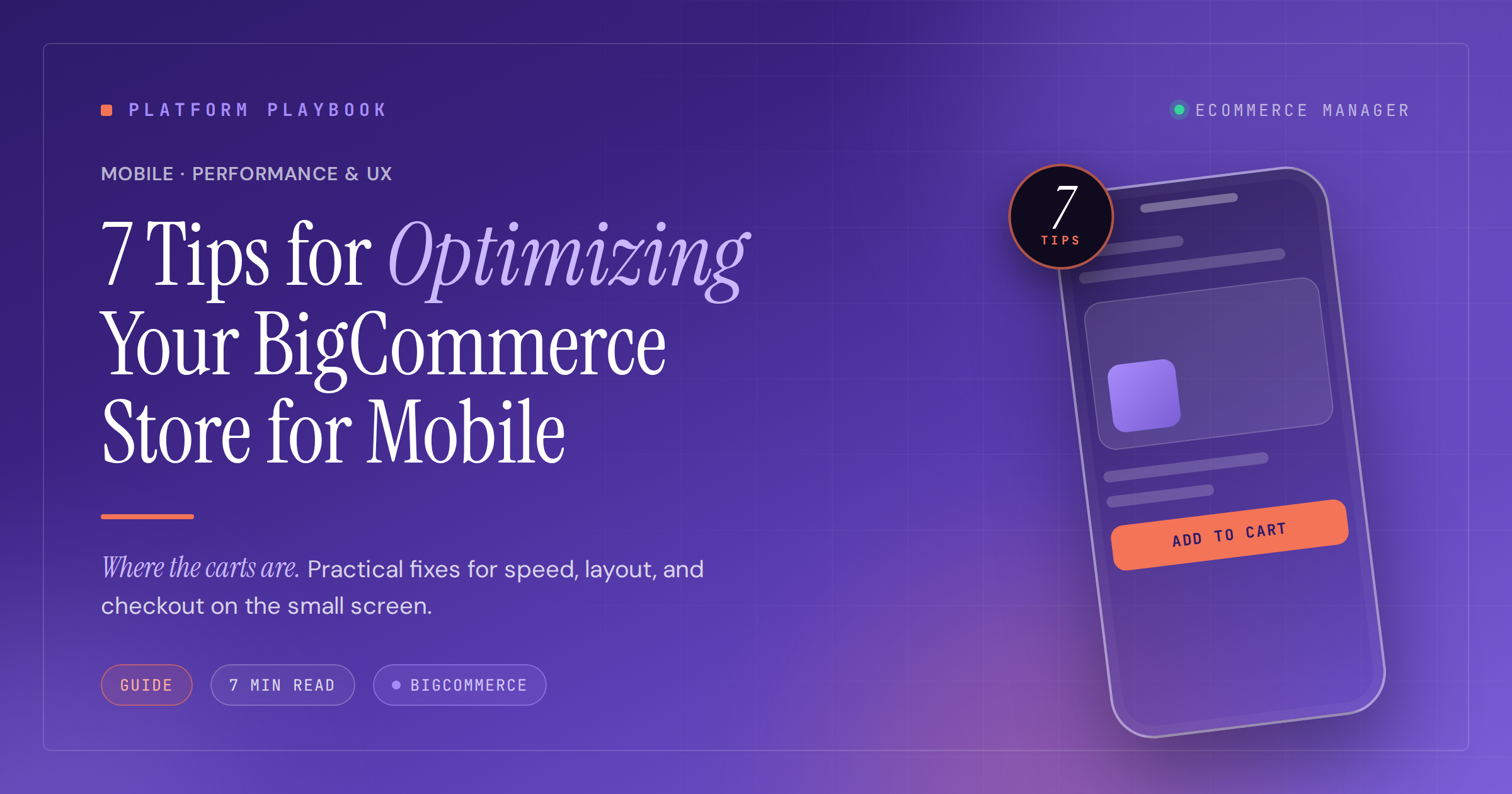
7 Tips for Optimizing Your BigCommerce Store for Mobile
Mobile commerce now accounts for over 70% of online sales, making a fast, frictionless mobile experience essential for any BigCommerce store. This guide presents seven practical optimization strategies that address the specific challenges of small-screen shopping, from thumb-friendly navigation to streamlined checkout processes. Each tip is backed by insights from ecommerce experts and focuses on tactics that directly improve conversion rates and customer satisfaction.
- Streamline Dual-Step Order Flow
- Embed Clear Subscription Terms at Selection
- Flatten Menu Depth to Two Taps
- Design Category Pages for Momentum
- Prioritize Fast Payments on Small Screens
- Adopt Thumb-Zone Navigation and AMP Speed
- Keep Buy Controls Always Visible
Streamline Dual-Step Order Flow
Simplify your mobile checkout flow before you touch anything else. That’s where most BigCommerce stores lose the most revenue on smaller screens.
We worked with a fashion retailer whose mobile conversion sat about 40% below desktop. When we reviewed the Hotjar recordings, the issue was clear. Checkout required five separate screens, form fields were too small to tap accurately, and a coupon code box kept pushing the entire layout around on entry. We rebuilt it into a two-step flow using BigCommerce’s Optimized One-Page Checkout, increased all tap targets to a minimum 48px, and collapsed the coupon field into a simple expandable link.
Mobile conversion went up 28% over six weeks. If you want to find your biggest opportunity, go through your own checkout on your phone first. Every friction point you feel is a moment your customer considers abandoning their cart.

Embed Clear Subscription Terms at Selection
The subscription toggle on the product page is where we spent the most time. On mobile, every extra tap you force a customer to make is a conversion you’re giving away, but in supplements you can’t just hide the subscription terms behind a modal to clean up the UI — FTC wants the cadence, price, and cancel path visible at the point of consent. So we built the disclosure into the toggle label itself: one tap, plain language under it, no second screen. Cart abandonment on mobile dropped, and legal stopped flagging the flow. In regulated DTC, simplification isn’t about removing the disclosure — it’s about putting it where the thumb taps.

Flatten Menu Depth to Two Taps
The highest-leverage mobile move on BigCommerce isn’t a widget — it’s flattening navigation so any product is two taps from the homepage. Mobile users tunnel, they don’t browse.
In projects I’ve led, deep category trees (Home – Category – Sub – Sub-sub – Product) work on desktop hover menus but break on mobile, where every tap is a decision point. The fix: collapse mid-tier categories into faceted filters on the parent category page. The category page becomes the hub; facets do the narrowing that subcategories used to do.
On BigCommerce specifically: rebuild the mobile menu around 5-7 top-level destinations, push secondary taxonomy into on-page filters, and route internal links from the homepage and blog straight into priority category and product pages instead of intermediate hubs. The tunnel shortens, and the pages that actually earn revenue get more internal link equity — which helps them rank too.

Design Category Pages for Momentum
Our top tip is to design mobile category pages for momentum, not completeness. Many BigCommerce stores show too much, too early, which creates friction on small screens. We prioritize fast scanning by simplifying the first view, tightening images, and making filters easy to reach. Mobile users are less patient with clutter, so the page should feel light even when the catalog is deep.
We implemented a collapsible filter drawer with clear labels and persistent selections. It lets shoppers refine quickly, then return to browsing without losing context. This change improved usability because people could adjust their path in seconds instead of restarting each time. We keep it simple, so users stay focused and move forward with less effort.

Prioritize Fast Payments on Small Screens
Treat mobile optimization as a checkout problem first, not a design problem. A BigCommerce store can look good on a phone and still lose orders if the buyer has to pinch, re-enter data, hunt for delivery costs, or wait for a heavy product page to load.
One feature we’ve implemented on mobile commerce projects is a sticky bottom checkout bar that follows the shopper after they add a product to the cart. It shows the cart total, delivery estimate, and one clear action, such as “Checkout” or “Continue to payment.” The key is that it doesn’t cover product options or trust signals, and it updates immediately when quantity, shipping, or promo codes change. We pair that with wallet payments like Apple Pay or Google Pay, because typing card details on a phone is still one of the easiest places to lose a motivated buyer.
The technical part matters too. On mobile, I would prioritize image compression, lazy loading below the first screen, fewer third-party scripts, and testing Core Web Vitals on real devices, not only in desktop tools. BigCommerce gives you a solid base, but themes and apps can still slow the store down if nobody audits them.
My advice is to map the mobile path from product page to paid order and remove every extra tap. If a customer can see price, shipping, trust information, cart status, and payment options without thinking, the store is mobile-friendly in the way that actually matters.

Adopt Thumb-Zone Navigation and AMP Speed
As a Senior Ecommerce UX Strategist with 7 years of experience optimizing digital storefronts across Northern European markets, my top tip for BigCommerce mobile optimization is to implement a sticky, thumb-zone navigation bar with a collapsible hamburger menu that collapses non-essential links. Research from the Nielsen Norman Group indicates that 49% of users perform one-handed mobile browsing, making bottom-mounted navigation critical for conversion.
In a recent project for a fashion retailer in Stockholm, I implemented an accelerated mobile pages (AMP) checkout flow with auto-fill address detection using Cloudflare Polish for image optimization, which reduced mobile page load times from 4.2 seconds to 1.3 seconds. This mobile-friendly feature increased mobile conversion rates by 34% and decreased cart abandonment by 28% within 60 days. The platform’s native AMP support delivers near-instant page loads, while responsive Stencil themes ensure layouts adapt fluidly to screen sizes without separate mobile sites.
Data from Google’s 2025 Mobile Commerce Report shows that 63% of shoppers now browse exclusively on smartphones, with load times exceeding 3 seconds causing 53% abandonment. By prioritizing responsive design, optimizing image delivery through Cloudflare Polish, and implementing sticky headers with voice search compatibility, stores achieve significantly better mobile performance. Regular cross-device testing remains essential since optimization is never one-time.

Keep Buy Controls Always Visible
Look, if you want to really optimize a BigCommerce store for mobile, stop obsessing over responsive design as just a visual thing. Start thinking about it as an interaction reduction challenge. That’s the real game.
The single most effective thing we’ve done is implement a sticky Add to Cart and Proceed to Checkout bar at the bottom of the screen. It stays visible the entire time someone is looking at a product. Think about it: mobile users are scrolling through these long descriptions, and if you force them to scroll all the way back up just to buy, they’re just going to leave. You’ve created friction. By keeping that call to action right there under their thumb, you turn that passive browsing into a proactive conversion flow. It works.
Beyond that, we’ve shifted to a search-first navigation overlay for mobile. Most people try to cram their entire desktop menu into a hamburger icon, but honestly, that’s just a headache for the user. Instead, we use a predictive search bar that pops up the second they tap the search icon. It lets customers skip the whole category tree process entirely. When you cut down the number of taps needed to find and add an item, you’re essentially giving them the speed of a native app inside a browser. It’s that simple.

Related Articles
- June, 2025 – 7 Ways to Improve Your Ecommerce Website’s Mobile Performance
- 17 Actionable Tips for Optimizing Your Shopify Store for Mobile—and the Results – eCommerce Manager
- Essential BigCommerce Features for Business Success: Insights from the Pros