

Last Updated on September 29, 2026
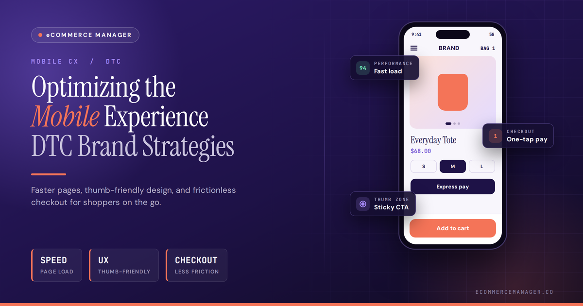
Optimizing the Mobile Experience: DTC Brand Strategies
Mobile optimization can make or break a direct-to-consumer brand’s success in today’s competitive market. This article compiles proven strategies from industry experts who have helped DTC brands improve conversion rates and customer satisfaction on mobile devices. These seventeen practical tactics address everything from streamlining checkout processes to improving search functionality and reducing friction at every touchpoint.
- Streamline One-Column Purchase Flow
- Replace Menus With Predictive Search
- Reduce Booking Choices
- Ensure Responsive Assets for Search
- Set Performance Budgets
- Complete Renewals in One Session
- Match Landing Pages to Intent
- Create Scannable Attorney Content
- Cut Excess Payment Fields
- Stack Essential Cable Specifications
- Enable Instant Estimate Requests
- Display Direct Contact Details
- Perfect the Phone Ring Builder
- Feature Tighter Product Crops
- Guide Safe Storm Documentation
- Place Short Forms Upfront
- Simplify Global Checkout
Streamline One-Column Purchase Flow
Mobile optimization is the foundation of my DTC strategy because it is where the majority of traffic and a growing share of revenue now live. Mobile accounts for about 76% of ecommerce traffic and roughly 63.5% of sales, yet it still converts at about half the desktop rate. That gap means every friction point on mobile costs more than the same issue on desktop.
One specific optimization I prioritize is a mobile-first checkout: large tap targets, auto-filled address and payment fields, persistent cart summary, and a single-column flow that removes distractions. I also test page speed and image weight aggressively because slow loads disproportionately hurt mobile conversion.
“In DTC, mobile is not a secondary channel; it is the primary experience you must perfect.”
The payoff is measurable: even small improvements in mobile load time and form friction can lift conversion rates meaningfully, closing part of the mobile-desktop gap.

Replace Menus With Predictive Search
We lost $47,000 in sales one Black Friday because our checkout button was 2 pixels too close to the edge of iPhone screens. Customers were accidentally triggering their back button instead of completing purchases. That single mobile UI mistake taught me more about optimization than any analytics dashboard ever could.
Here’s what nobody talks about: mobile optimization isn’t about making your desktop site smaller. It’s about completely rethinking the purchase journey for someone standing in line at Starbucks with one thumb. When I ran my e-commerce brand, we discovered that 73% of our mobile traffic came during commute hours and lunch breaks. These weren’t browsing sessions, they were micro-moments where people had maybe 90 seconds to decide.
The one thing that moved the needle more than anything? We killed our mobile navigation menu entirely. Sounds insane, right? Instead, we built a smart search bar that appeared the second you landed on the site. It used predictive text based on your previous searches and popular products. Conversion jumped 34% in three weeks because we stopped making people hunt through menus with their thumbs.
The other move that actually mattered was reducing our product images from 8 photos to 3 on mobile, but making those 3 zoomable and swipeable. Customers weren’t scrolling through full galleries anyway. They wanted to see the product, zoom on details, and checkout. We were designing for how we thought people should shop, not how they actually did.
At Fulfill.com, I see brands obsessing over page load speed and ignoring the fact that their checkout requires 14 form fields. Speed matters, but friction kills more sales. One tap to autofill shipping from Apple Pay beats a fast-loading manual form every time.
The brands winning on mobile treat it like a different channel entirely, not just a responsive version of their website. Your customer is probably holding their phone in one hand while doing something else. Design for that reality.

Reduce Booking Choices
For our company, mobile does not represent an online storefront, but rather represents the entrance point. First-time bookings occur primarily on a user’s phone. The majority of these bookings take place within a day after a customer has heard about the Beer Spa concept. Thus, it can be concluded that the mobile booking flow is where we spend the most time. If a new visitor experiences some form of friction (e.g. confusion with a date selection tool, too many upsell options) as part of their mobile booking process prior to fully understanding the purpose of the Beer Spa, he/she/they will have left our site before experiencing what we have created.
In an effort to understand at which point users drop-off from the website, we watched where people were dropping off, and also reviewed the “couldn’t book on my phone” e-mails from customers. We subsequently reduced the number of decision points associated with the mobile path to three: date selection, party size, and add-on selections. All other elements (gifting, retail, membership, etc.) would be communicated via e-mail post visit once they know why they’d want more. Retail attach happens in-venue, where the environment sells for us. Mobile’s job is just to get them through the door.

Ensure Responsive Assets for Search
I’ve spent 15 years scaling digital strategies for startups and established brands, with a core focus on SEO and mobile performance that directly impacts how customers discover and engage with DTC sites.
Mobile optimization isn’t optional in search today because Google ranks entirely on the mobile version of pages. One approach we take is ensuring full access for Googlebot to CSS, JavaScript, and images while using the srcset attribute so visuals load responsively without slowing down mobile sessions.
This keeps content consistent across devices and cuts bounce rates that hurt visibility. We validate everything through regular Lighthouse audits and Search Console data to spot crawl issues or loading problems before they affect rankings.

Set Performance Budgets
We see mobile performance as a business issue rather than only a technical measure. In direct-to-consumer retail, customer attention disappears quickly across social, search, and email. We know shoppers arrive with limited patience and high expectations from every visit online. A slow or unstable first screen can weaken the strongest message before it connects.
We use a mobile performance budget to guide every page decision early in planning. We review images, scripts, and external tools before they are approved for launch together. This helps every team spot trade-offs before speed becomes a larger business problem later. We track real customer experiences because everyday network conditions change across devices and locations.

Complete Renewals in One Session
Mobile is important to us because people often handle registration while they’re already in the middle of something. They notice an expired tag, need to renew quickly, or realize they’re missing a document. A lot of the time, the phone is what they have in front of them.
One thing we focus on is enabling a customer to complete the renewal in a single session. They can enter their vehicle information, pay online, get confirmation by email, and receive a digital copy of their registration card once it’s processed. The physical card and sticker are mailed afterward.
If someone starts a registration transaction on their phone, they should be able to finish it there without calling us, switching devices, or going to a DMV office.

Match Landing Pages to Intent
Mobile optimization is where DTC strategy either converts or leaks money. At 1558, we treat the phone as the first storefront because so many customers discover brands through Google, paid ads, and local search before they ever meet the business.
One specific thing I do: I avoid sending mobile ad traffic to a general homepage. We build mobile-first landing pages with the offer, proof, and primary CTA visible immediately, then track the actions that matter.
For example, with Google Ads or local campaigns, the mobile page needs to match the exact intent of the search. If someone searched a service “near me,” they should not have to dig through your About page to understand what you do, where you serve, and what to do next.
The Reddit-level takeaway: open your own campaign on your phone with one thumb and a short attention span. If the next step is not obvious in five seconds, your customer is probably gone.

Create Scannable Attorney Content
Mobile optimization matters because most people search for attorneys straight from their phones in the moment they need help. We design every client site around that reality so the first impression lands fast and builds trust without extra effort.
One way we optimize is by turning the discovery interview into a custom AI avatar that generates content already formatted for small screens. This keeps the attorney’s real voice clear and scannable whether someone is reading on the subway or in a parking lot.
It works because we treat the website as the conversion engine, not a brochure, and mobile users decide quickly if the firm feels credible. Our Army background taught me to cut through noise with simple, reliable systems that actually serve the client in front of you.

Cut Excess Payment Fields
Mobile isn’t a smaller version of desktop; it’s the primary store now, so we design checkout for a thumb, not a mouse. The single biggest lever is cutting every non-essential field before payment. Every extra tap between “I want this” and “I’ve paid” is a customer deciding it’s not worth it. We audit checkout drop-off by device every month, not just by channel, because the friction points on mobile are almost always different from what shows up on desktop analytics.

Stack Essential Cable Specifications
Mobile is where our shop lives. Most people who buy an EV charging cable from us are on a phone, and a fair number are standing next to the car or the wallbox while they do it, checking what plug is staring back at them. Design for a desk and you have designed for the wrong moment.
The specific change I would point to is what we did with the spec table. Ours started life as a wide grid: connector type, phase, amperage, cable length, weight, rating. On a phone, that turned into something you had to swipe sideways to read, with the column headings sliding out of view as you went. People were pinching and scrolling to compare two cables and giving up. When we surveyed 3,180 UK EV drivers for our cable research, the answers made it obvious that buyers check a small handful of facts before they trust a listing, and everything else is reassurance they read later, if at all. So we stacked the specs as plain lines, put the few that decide the purchase at the top where no scrolling is needed, and left the full detail below for anyone who wants it.
Pre-sale questions to our support inbox fell after that went live, which is the number I watch, because every question we get on a product page is a customer who could not find something we had already published. The second thing we do is test on a cheap handset outdoors, in daylight, with gloves on if it is cold. Half the mobile problems worth fixing never show up on a designer’s screen in a warm office.

Enable Instant Estimate Requests
With over two decades in marketing and strategy prior to running FoamWorks Concrete Leveling, I view mobile optimization as the critical front door to our direct-to-consumer model. Most homeowners notice an uneven sidewalk or sinking patio while standing outside in their yard, making their phone the immediate point of contact.
One specific way we optimize mobile is streamlining our free on-site estimate flow directly into our customer care scheduling pipeline. A homeowner can request an evaluation from a System Design Specialist right from their driveway without navigating clunky forms or dense menus.
Whether someone needs PolyLevel foam injection to lift settled concrete or NexusPro to seal damaged joints, the mobile experience is tailored for zero-friction scheduling. In local home services, reducing mobile tap friction is what immediately turns a safety concern into a confirmed appointment.

Display Direct Contact Details
Running a fully online watch dealership means if your mobile experience is broken, your business is broken. Every serious buyer I deal with has already checked out the listing on their phone before they ever email me.
The single most impactful thing I’ve done is keeping product listings brutally clean on mobile—full-set details, GST-inclusive pricing, nothing buried. Buyers in this market are educated, and they’ll leave immediately if they have to pinch-zoom through cluttered pages to find basic information.
The specific thing that’s moved the needle: making my direct contact—phone number and email—immediately visible on mobile without scrolling. Luxury watch buyers want to talk to a human, not navigate a chatbot. That one friction point, if you remove it, converts browsers into real conversations fast.

Perfect the Phone Ring Builder
Mobile matters enormously when someone is browsing engagement rings at 11 p.m. from their couch—that’s real purchasing behavior we see constantly in fine jewelry.
One thing I’ve pushed hard at John Atencio is making the Ring Builder genuinely usable on a phone screen. Customizing a diamond engagement ring involves multiple decisions—shape, setting, stone type—and if that experience is clunky on mobile, you lose the customer right at the moment they’re most emotionally invested.
Our complimentary two-day delivery and in-store pickup options also have to surface cleanly on mobile, not buried in footers. When someone decides to buy, the path from “I want this” to “it’s ordered” needs to be frictionless on whatever screen they’re holding.

Feature Tighter Product Crops
Mobile optimization is central to our DTC strategy because many customers first discover our products through social media or Pinterest on their phones. One specific improvement is using mobile-focused product imagery instead of simply shrinking the desktop version. A wide room photograph may look impressive on a large screen but make the artwork almost impossible to see on a phone. We use tighter crops that let the print fill more of the mobile screen, then keep the title, price and purchasing options close beneath it. This gives customers a clear view of the product and shortens the path from discovery to purchase.

Guide Safe Storm Documentation
I own Prime Roofing & Restoration in Alabama, and mobile is huge for us because roof problems usually start as “I’m looking at a leak right now” moments. In DTC, the phone is often the first inspection window.
One specific thing we optimize for mobile is storm-damage documentation. We make it easy for customers to understand what photos to take, what details matter for an insurance claim, and when to stop and call instead of climbing on the roof.
That matters because the best mobile experience in roofing is not just “book now.” It is helping someone make a safe, informed decision while water is coming in or shingles are missing.
For example, after wind or storm damage, a homeowner can quickly move from “Do I have a claim?” to “I need a free inspection or emergency tarping.” That shortens confusion and helps us show up with better information from the first conversation.

Place Short Forms Upfront
As the CEO of CI Web Group, I see mobile optimization as the critical front door for direct-to-consumer search, where customers need immediate solutions on small screens. When consumers search for services on their phones, even slight friction or slow load times will cause them to bounce to a competitor.
One specific way we optimize the mobile experience is by designing simplified, high-converting layouts built on platforms like Webflow and placing short contact forms right at the top of the page. Limiting fields to just the essentials—like name, phone number, and a brief description—removes friction so users can take action without excessive scrolling.
We also pair this with mobile-integrated AI chatbots that allow visitors to ask questions and convert instantly during off-hours. In one of our client implementations, shifting to a fast-loading, mobile-first experience contributed to an 11 percent increase in website clicks and a 33.8% rise in organic revenue.

Simplify Global Checkout
Mobile optimization is central to our DTC strategy because the majority of customer interactions with our store happen on handheld devices, and a smooth mobile experience directly affects discovery, conversion and repeat purchases. We treat mobile-first design as a business requirement, not an afterthought.
One concrete action: we run a streamlined, mobile-first checkout that reduces required fields, uses large tappable controls and surfaces clear international shipping options early in the flow to avoid cart abandonment for our global customers.

Related Articles
- Ecommerce Website Optimization: Tips for Increasing Conversions
- Creating a Seamless Checkout: Ecommerce Tips From The Pros
- 7 Tips for Optimizing Your BigCommerce Store for Mobile